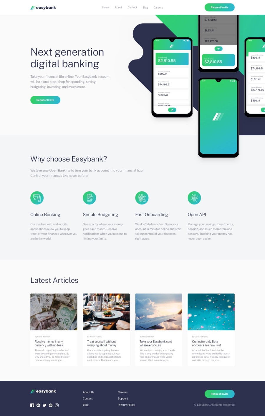
Responsive Easybank Landing Page using Bootstrap 5
Design comparison
Solution retrospective
Hello everyone!
I decided to risk and just finished my first intermediate project!
The most difficult part was positioning the image in the right place without compromising page flow and scrolling.
I used Boostrap for the navigation toggle, but according to the challenge description this can also be accomplished without using JavaScript and I found this demo, so I'll leave it here for anyone who might be interested: https://codepen.io/jason-knight/pen/jOzjmgg?editors=1100
Actually, Bootstrap did a good part of the job on positioning, specially the cards. I tried to do without it first for practice purposes, but it makes everything so much easier that I ended up using it for several page elements. No sure if this is a good practice, does anyone have a comment on this?
Any suggestion on how I can improve my code are always welcome. Thanks for your attention! 🌻
Community feedback
Please log in to post a comment
Log in with GitHubJoin our Discord community
Join thousands of Frontend Mentor community members taking the challenges, sharing resources, helping each other, and chatting about all things front-end!
Join our Discord
