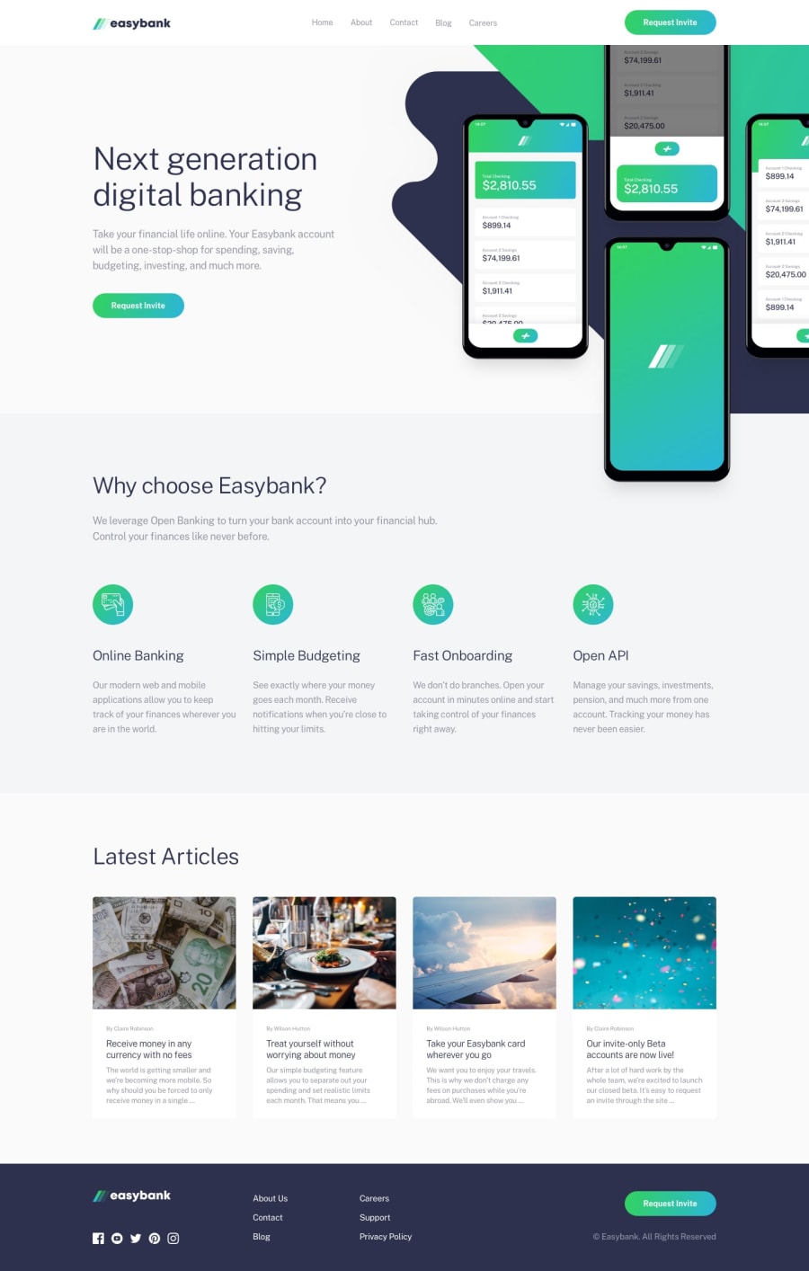
Design comparison
SolutionDesign
Solution retrospective
Hi everyone,
I would appreciate it if you could give me some feedback on my code.
Did you take different approach to "hiding" half of the mockups image? I used overflow-x: hidden, but I often hear that using overflow isn't the best practice. How did you solve this?
Thank you
Klara
Community feedback
Please log in to post a comment
Log in with GitHubJoin our Discord community
Join thousands of Frontend Mentor community members taking the challenges, sharing resources, helping each other, and chatting about all things front-end!
Join our Discord
