Responsive Easybank Landing Page 💚 [HTML, SCSS, JS, Vite]

Solution retrospective
This is my second Intermediate project!
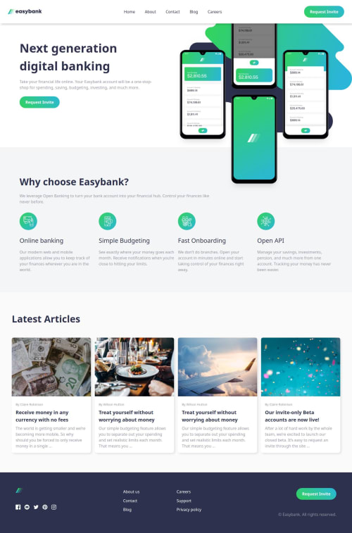
I've been very excited to get my hands on this wonderful project. I attempted to complete this challenge a few weeks ago and was overwhelmed by the design. But, here it is. Today, I completed the Easybank landing page using HTML, SCSS and Vanilla JS. I had fun building the expandable navigation bar.
I'm proud of creating this beautiful layout and patterns that are very well put out together.
What challenges did you encounter, and how did you overcome them?Switching the hamburger icon on click with a close icon is still really confusing for me. I have tried it many times and it fails to work the way I expect it to. So, the icon does not change but the navigation bar does expand and collapse on click.
Getting it responsive was another challenge because of the articles section. This is my first time creating something like that. I tried doing it with subgrid and it broke on my mobile. So, I removed it and did some work with position: absolute on the image itself.
I have done my best in creating this project. As a beginner, your feedback is extremely valuable to me.
Any suggestions are welcome! 😃
Please log in to post a comment
Log in with GitHubCommunity feedback
No feedback yet. Be the first to give feedback on Tharun Raj's solution.
Join our Discord community
Join thousands of Frontend Mentor community members taking the challenges, sharing resources, helping each other, and chatting about all things front-end!
Join our Discord