Submitted over 1 year ago
responsive easybank landing page design with html, css and javascript
@stephenolajire
Design comparison
SolutionDesign
Community feedback
- @juarezv90Posted over 1 year ago
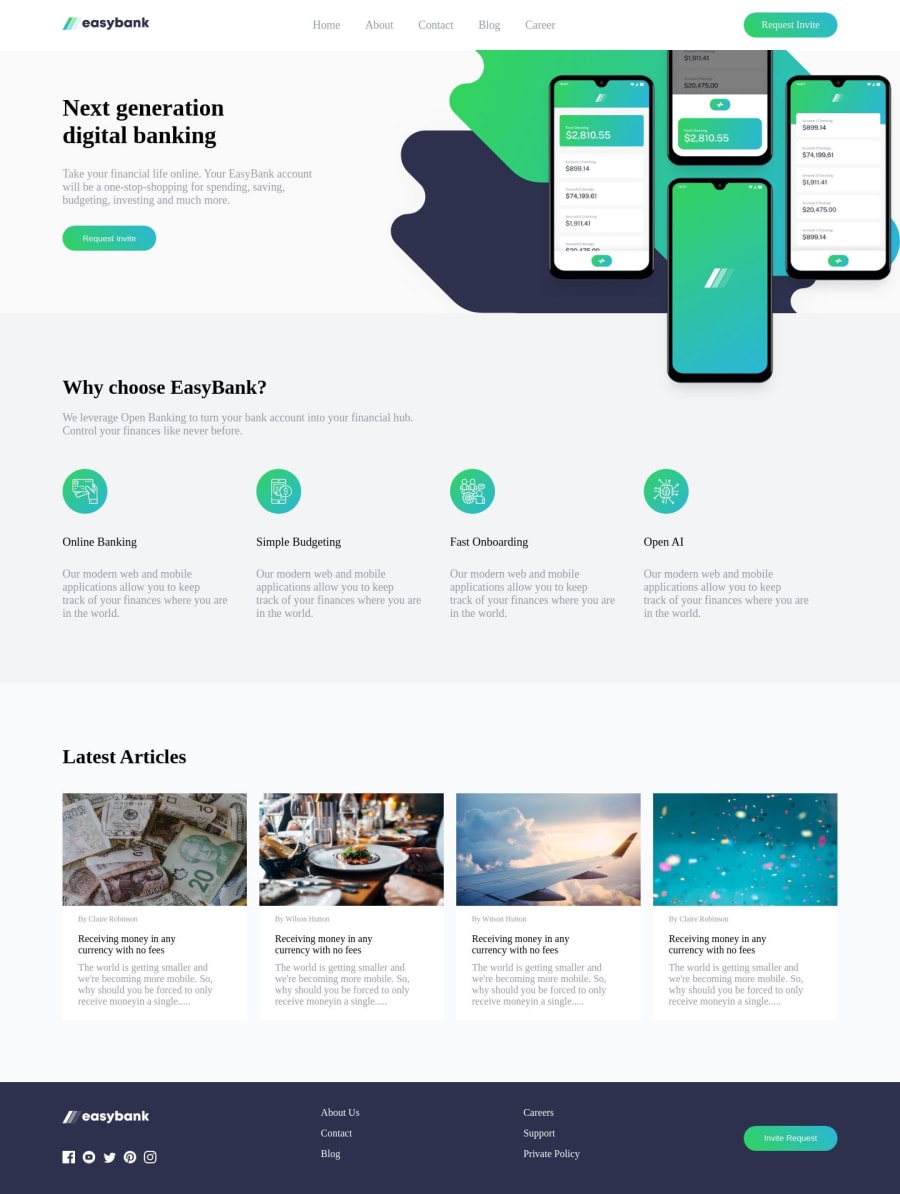
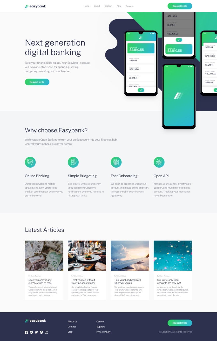
- Imaging sizing and position need work, in desktop mode you're sizings are uneven and your Hero image bleeds over and covers the next section.
- Try using
object-fit: coverin your CSS for maintaining images and not giving themm stretched appearance. - Scaling needs work for larger screen sizes, possibly putting the entire page in a container with a
max-width: 1440px; margin: 0 auto;to keep it from oversizing your layout and have it centered on the page. - It looks like a lot of the hover effects are missing and the links do not have even demo function that shows that they are working links that could be programmed easily later on.
Overall
The site comes close to replicating the design but falls short on some structure aspects and CSS configurations.
0
Please log in to post a comment
Log in with GitHubJoin our Discord community
Join thousands of Frontend Mentor community members taking the challenges, sharing resources, helping each other, and chatting about all things front-end!
Join our Discord
