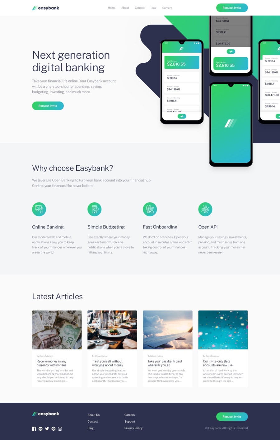
Design comparison
Solution retrospective
I would love to have feedback and comment from all of you
Community feedback
- @FluffyKasPosted over 2 years ago
Hey,
It looks great on all screens, well done! I only noticed a few things:
-
Your images are missing alt texts. All images must have them, even if you just leave them empty (in case they're decorative images).
-
Instead of using
divs for lists you could go withul(in the nav and footer links, for example). -
All your sections should go inside a
main, because at the moment they aren't contained by any landmarks. ^^ -
Your social media links should have aria-labels describing where the links lead (as they're images only, without any text description).
Marked as helpful1@NAZIRwill29Posted over 2 years ago@FluffyKas Thank you for your feedback.
0 -
Please log in to post a comment
Log in with GitHubJoin our Discord community
Join thousands of Frontend Mentor community members taking the challenges, sharing resources, helping each other, and chatting about all things front-end!
Join our Discord
