Submitted almost 2 years ago
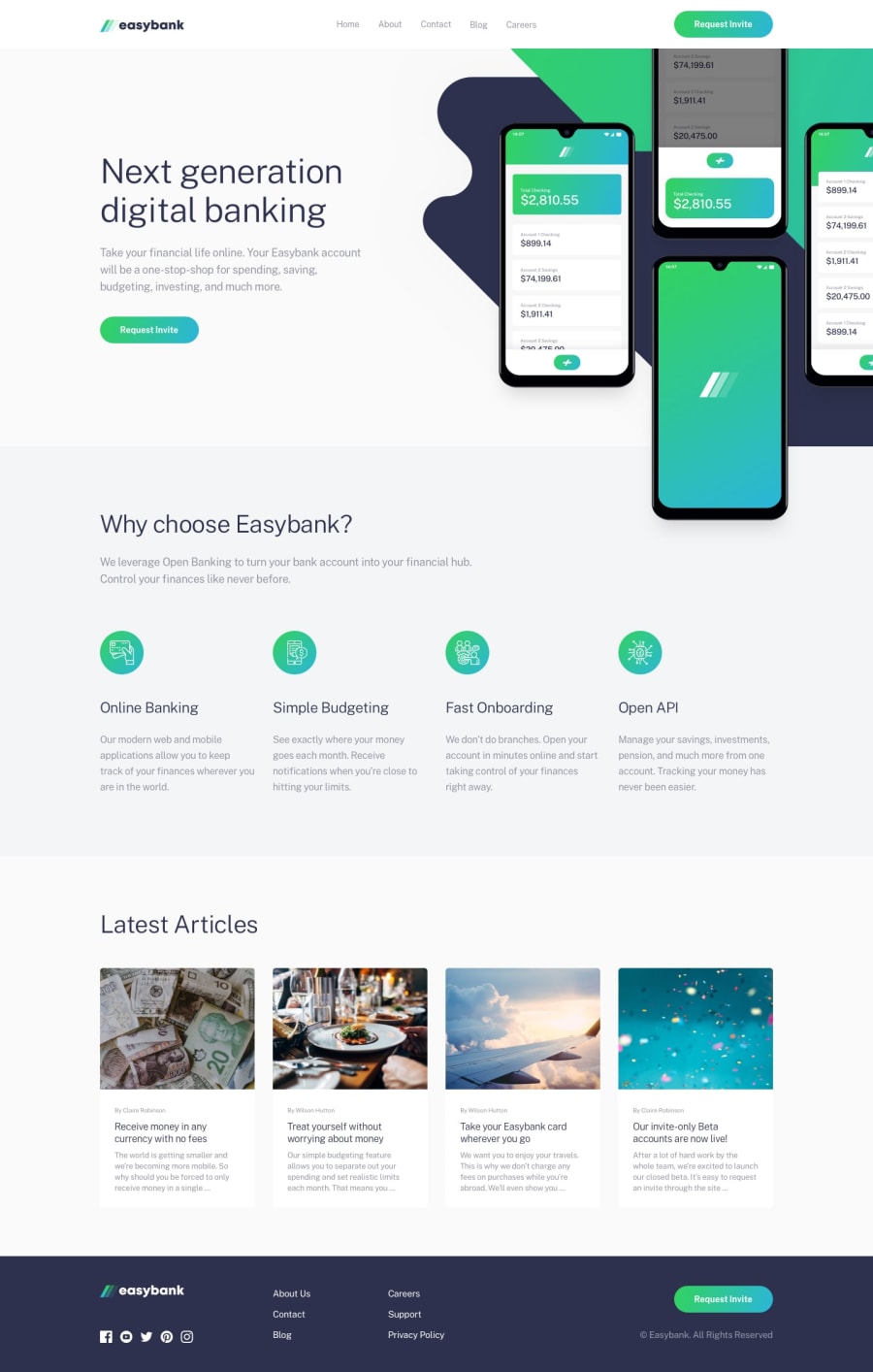
Responsive Easy Bank Landing Page
@alishertoshmurodov
Design comparison
SolutionDesign
Solution retrospective
It was a good challenge. I could not make the filter when opening the menu on mobile as in the design image. I will work on the little details now.
Feel free to give feedback.
Community feedback
- @nuel1Posted over 1 year ago
You were inconsistent with the font size. I think that's all. You did great although 👍😁
0
Please log in to post a comment
Log in with GitHubJoin our Discord community
Join thousands of Frontend Mentor community members taking the challenges, sharing resources, helping each other, and chatting about all things front-end!
Join our Discord
