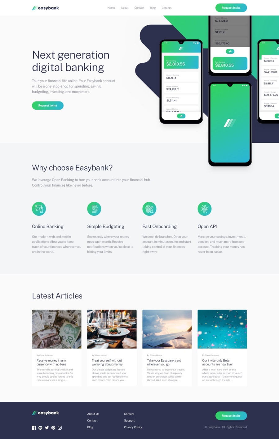
Design comparison
Solution retrospective
Had a problem with reducing text to fit the device. And also changing the color of the icons on the footer section when hovered or focused became a challenge.
Community feedback
- @JusticeJatauPosted 9 months ago
This comment was deleted 9 months ago
0@JusticeJatauPosted 9 months agoI faced the same issues too, but found a way to fix it,
for those text in paragraph tags, you have to select the specific tag for it to change the desire text. For example:
<div class="container">
    <p>This is a paragraph</p>
 </div>
Css
 .container p{
     font-size: 18px;
}
for those text in anchor tags, you have to select the anchor tag for it to work
<div class="container">
    <a href="#">This is a link</a>
 </div>
Css
.container a{
    font-size: 18px;
}
Then for the icon hover, you have to
- look for the SVG file and set the "fill" to nothing
- then select the SVG in css and set fill to white
- then set the fill hover property
selector:hover{
    property:value;
}
svg:hover{ fill: blue; }With this approach, you will have to put the SVG in html instead of image.
Instead of
<footer>
    <img src="image.svg">
</footer>
open the SVG.svg file in your text editor, copy and paste the code in your html
<footer>
    <svg code>
</footer>
0
Please log in to post a comment
Log in with GitHubJoin our Discord community
Join thousands of Frontend Mentor community members taking the challenges, sharing resources, helping each other, and chatting about all things front-end!
Join our Discord
