Design comparison
SolutionDesign
Community feedback
- @KingSkyrosPosted over 1 year ago
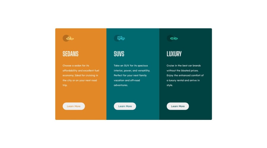
Hello, This is a great outcome, but the spacing between
<p>and<h1>is too wide. Also, the icons should be slightly bigger.Hope this is helpful 👍
0
Please log in to post a comment
Log in with GitHubJoin our Discord community
Join thousands of Frontend Mentor community members taking the challenges, sharing resources, helping each other, and chatting about all things front-end!
Join our Discord
