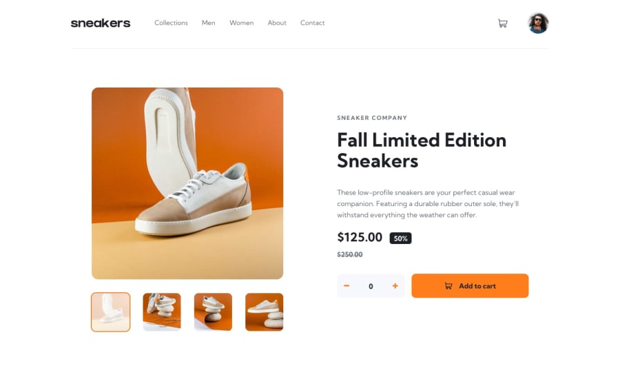
Responsive e-commerce product page using CSS Flex, Grid, JS
Design comparison
Solution retrospective
- I did this without the use of a JS framework, even though a framework would have been faster I think.
- I've done the thumbnail navigation, and then adapted it for the lightbox, and then for the smaller screens.
- Would probably give more though to the css sizes, and try to use rem instead of px where it makes sense.
- Creating the thumbnail navigation for the lightbox - did it using data attributes and some DOM traversing.
- Refactoring the thumbnails navigation to work both inside the lightbox and on the smaller screens - it worked with passing the parent container as a parameter to the navigateThumbnails function and adding some optional chaining.
- Adapting the active state for mobile, especially the shopping cart position - did it by using absolute positioning and some translation.
Maybe there is a better way of refactoring the functions and handling the responsiveness.
Community feedback
- @krushnasinnarkarPosted 6 months ago
Hi @Antonvasilache,
Congratulations on successfully completing the challenge!
I have suggestions regarding your code that I believe will be of great interest to you.
-
Container Positioning: I noticed that your container is not positioned properly after a screen size of 1210px. This is mostly due to the padding you've added to the body. If you remove it, the problem should be resolved.
-
Media Queries Optimization: You are using too many media queries for small adjustments. Try to use fewer media queries by combining them. For example, you can make the
.navhidden at the same time you make the main section vertical. Avoid adding multiple media queries for minor changes. -
Overlay Close-Icon Position: Your overlay looks perfect in inspect mode, but on a normal screen, the close icon is out of view. This is mostly due to the inline CSS added to the image:
/* width: 100%; */
/* max-width: 550px; */
/* height: 100%; */
/* max-height: 550px; */
If you remove these properties, it should work fine. Also, you need to position the arrows properly after making these changes.
I hope you find this helpful, and I would greatly appreciate it if you could mark my comment as helpful if it was.Feel free to reach out if you have more questions or need further assistance.
Happy coding!
Marked as helpful1 -
Please log in to post a comment
Log in with GitHubJoin our Discord community
Join thousands of Frontend Mentor community members taking the challenges, sharing resources, helping each other, and chatting about all things front-end!
Join our Discord
