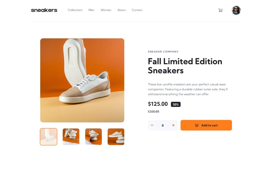
Design comparison
Solution retrospective
Hello, here is my solution for this really cool project :)
I'm very proud of how much my website looks like compared to the original design ! Moreover, I think that the responsiveness is pretty decent. Also, I used "localStorage" to keep the amount of the product to the cart even if the user leaves the page !
What challenges did you encounter, and how did you overcome them?Concerning the challenges, I made a "focus" section by clicking on wide product pictures (rather than having the same section with a slider etc...). I tried but it was too complicated for me...
What specific areas of your project would you like help with?I would like you to tell me if my code (whether HTML, CSS or JavaScript) is correct ? Maybe also if there is a section that I could have done differently ?
I will take all the help I can get ! Thanks for taking a look at my solution :)
Community feedback
Please log in to post a comment
Log in with GitHubJoin our Discord community
Join thousands of Frontend Mentor community members taking the challenges, sharing resources, helping each other, and chatting about all things front-end!
Join our Discord
