Submitted 9 months agoA solution to the E-commerce product page challenge
Responsive-e-commerce-product-page

@mike15395
Solution retrospective
What are you most proud of, and what would you do differently next time?
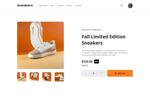
I was lot of work and took me 4days to complete the challenge.
What challenges did you encounter, and how did you overcome them?lightbox was quite challenging and lengthy.Menu sidebar for mobile and tablet was quite tough. I overcome those challenges by studying those CSS properties well and applied it.
What specific areas of your project would you like help with?Menu-sidebar for mobile and tablet CSS part and header nav elements hover orange border on bottom. Code got too long specially CSS part,help me optimize it. Any other improvements are highly appreciated.
Code
Loading...
Please log in to post a comment
Log in with GitHubCommunity feedback
No feedback yet. Be the first to give feedback on Mikhil Desai's solution.
Join our Discord community
Join thousands of Frontend Mentor community members taking the challenges, sharing resources, helping each other, and chatting about all things front-end!
Join our Discord