


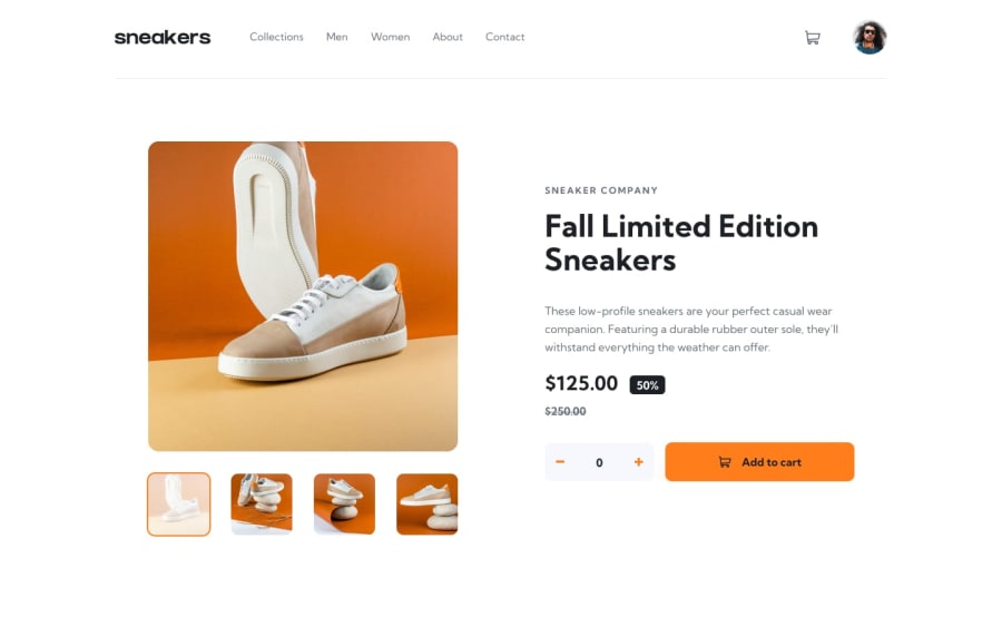
Design comparison
SolutionDesign
Solution retrospective
What are you most proud of, and what would you do differently next time?
I learned a lot about JavaScript. This felt more advanced than a level 3 challange, probably because there were so many small details to consider. Once again, I did things without proper planning, which is likely why it felt more difficult than it actually was. So, next time, I'll make sure to plan before starting.
What challenges did you encounter, and how did you overcome them?I need to improve at positioning elements, and dealing with responsiveness was challenging. I focused a lot on functionalities, and towards the end, the layout became difficult to manage. These issues can also be addressed with better planning.
Community feedback
Please log in to post a comment
Log in with GitHub
Join our Discord community
Join thousands of Frontend Mentor community members taking the challenges, sharing resources, helping each other, and chatting about all things front-end!
Join our Discord