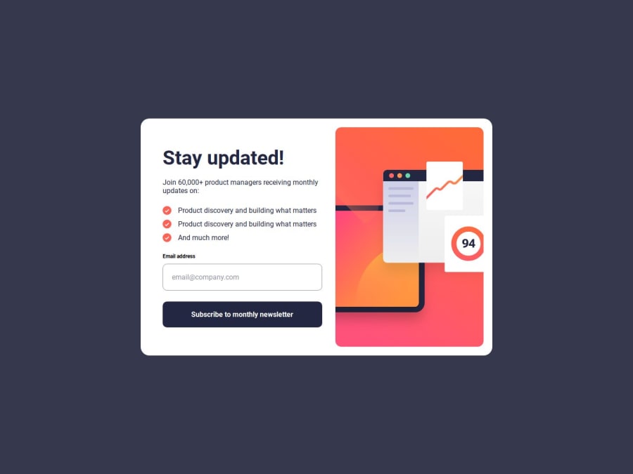
Design comparison
Solution retrospective
I'm happy that I have managed to complete the challenge as close as possible, and reaching all requirements in order to finish it, such as the hover status and the sign-up validation and change between the sign-up phase and the thank you message.
What challenges did you encounter, and how did you overcome them?I had some issues at the end when I looked into finding a way to get the sign-up HTML and thank you HTML switch between each other depending on what the user does and if the email input is valid.
I prompted ChatGPT with a few messages and also played around with wrapping the sections in divs in order to not have the "display: block/flex" done in JavaScript affect the layout, but at the end, the solution was having the write code wrapped properly.
What specific areas of your project would you like help with?.
Community feedback
Please log in to post a comment
Log in with GitHubJoin our Discord community
Join thousands of Frontend Mentor community members taking the challenges, sharing resources, helping each other, and chatting about all things front-end!
Join our Discord
