Submitted over 2 years ago
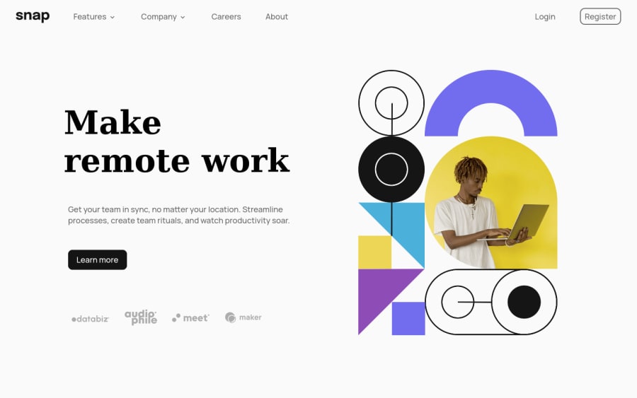
Responsive dropdown Menu using HTML SCSS JS
#sass/scss#accessibility
@lifeaddikt
Design comparison
SolutionDesign
Solution retrospective
Any feedbacks would be welcome !
I had some difficulties on the dropdown menu i have used position:fixed.... it would be better to use position : absolute i guess... but i didn't have a parent item to do it properly.
I also add difficulties on the desktop on sharing the main content in 2 sections that are well responsive. I'm steel learning flex-basis, flex-shrink and grow... Im not clear with everything.
Thank's :)
Community feedback
Please log in to post a comment
Log in with GitHubJoin our Discord community
Join thousands of Frontend Mentor community members taking the challenges, sharing resources, helping each other, and chatting about all things front-end!
Join our Discord
