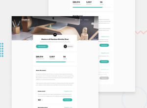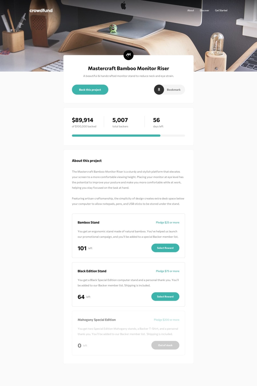
Responsive Donation page made with Vanilla JS. Updating components.
Design comparison
Solution retrospective
Let me know if any bugs occur! Would be grateful to received feedback on the JS mainly as I am unfamiliar with best practices.
Community feedback
- @darshii98Posted over 3 years ago
Your amount increases but backers don't increase. So maybe try to change that!!. Also adding some transitions might help smooth things out in case of buttons and bookmark. Awesome Job bdw!!
Marked as helpful0@Tyson-WellingsPosted over 3 years ago@darshii98 Good catch! I'll make the changes now. Thanks for taking the time to check throughly!
0 - @mariusfaPosted over 3 years ago
Slick. In my opinion I think you improved the design :)
Just some minor things I noticed. 1: I think you are missing a padding or margin below the continue button in "Enter your pledge"
2: I think "Enter a pledge" should be a label with a "for" attribute pointing to the id of input field. This will help for screen readers and automatic testing like selenium/playwright/puppeteer.
<label for="myInputId">My label</label>
<input id="myInputId" />
3: When setting input for pledge and pushing enter, nothing happens. Same for phone. Next/Enter button on phone/android keyboard does not submit. This is easily fixed by wrapping the input and continue button in a form.
These are just minor things. Great work
Marked as helpful0@Tyson-WellingsPosted over 3 years ago@mariusfa Thank you for your suggestions in terms of accessibility! This is definitely an area that I struggle with. Also good catch with the enter button! I personally rarely fill out forms that way so that aspect missed my testing :). Thank you for your feedback overall and good luck with your future projects.
0
Please log in to post a comment
Log in with GitHubJoin our Discord community
Join thousands of Frontend Mentor community members taking the challenges, sharing resources, helping each other, and chatting about all things front-end!
Join our Discord
