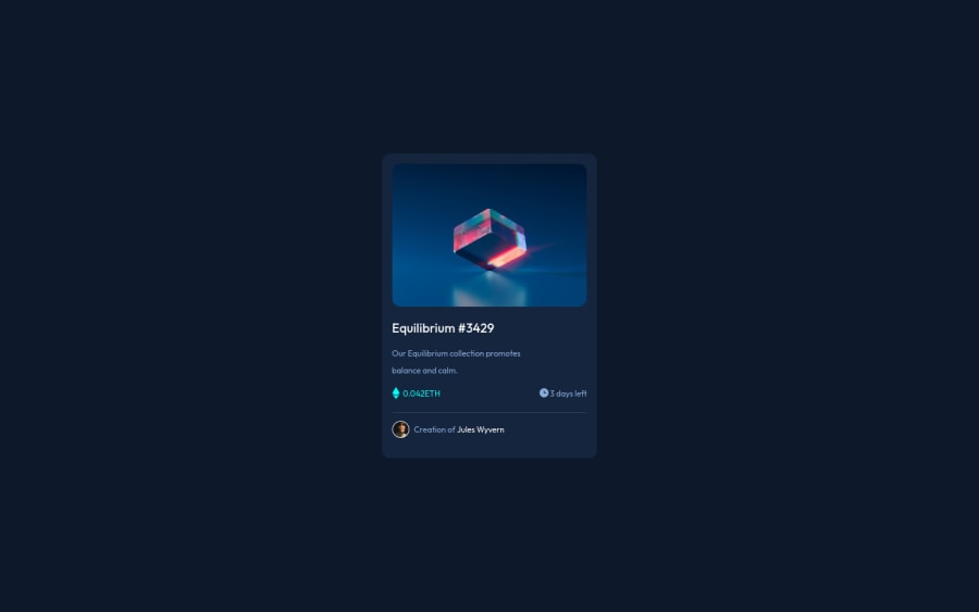
Design comparison
Solution retrospective
- I could not add the hover effect on the equilibrium image.
Community feedback
- @12KentosPosted over 2 years ago
Hey @keltech18 Nice job on completing the challenge!
I do have a couple of suggestions, first I noticed you did some inline css in the html file, while that's ok for a small project like this, I would suggest avoiding doing that as much as possible. It's really bad practice and will cause a TON of issues for you down the road on future/larger projects.
Secondly I noticed you selected elements directly like so.
h1 { font-size: 18px; font-family: 'Outfit', sans-serif; font-weight: 600; color: hsl(0, 0%, 100%); }Once again, while this was ok in a small project like this, it will cause a lot of issues and headache in future projects. The problem with this, is the above code won't just affect the h1 of the eth card, you just made but every single h1 on the website. I would suggest in the future giving the element a class, and selecting it that way. It might be a little more tedious but will save you a lot of time in the future.
Lastly as for you question regarding the hover affect, here is the mdn documentation on the
:hoverPseudo class.You can also find a lot of videos on youtube explaining how to use it, this would be your best/easiest way of getting the hover affect you want.
Hope that helps!
Marked as helpful0@keltech18Posted over 2 years ago@12Kentos thank you so much for the tips, I find them really helpful, I will appreciate your future comments on next challenges. Thanks
0
Please log in to post a comment
Log in with GitHubJoin our Discord community
Join thousands of Frontend Mentor community members taking the challenges, sharing resources, helping each other, and chatting about all things front-end!
Join our Discord
