Submitted over 4 years ago
Responsive desktop/Mobile site using HTML/CSS/JS

P
@alanjheffernan

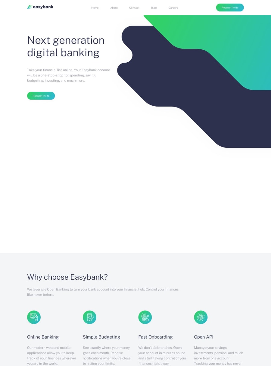
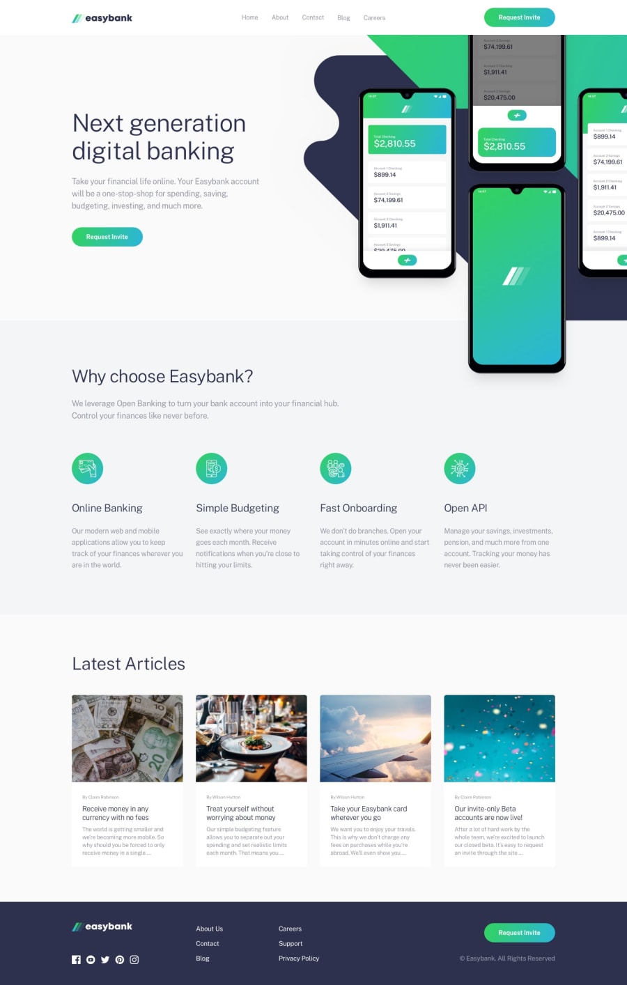
Design comparison
SolutionDesign
Solution retrospective
Had a couple of problems,
-
Changing colours of SVG images
-
Getting the background image in the header to overflow and look good when changing screen size
-
Placing the footer "Request invite" div content to the end of the div
Any help/feedback would be appreciated, Thanks!
Community feedback
Please log in to post a comment
Log in with GitHub
Join our Discord community
Join thousands of Frontend Mentor community members taking the challenges, sharing resources, helping each other, and chatting about all things front-end!
Join our Discord