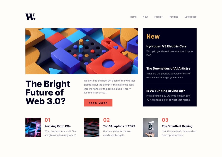
Design comparison
Solution retrospective
Any feedback is appreciated! Thank you!
Community feedback
- @pablo-obrachPosted over 1 year ago
Good job for finishing the challenge
A few things could be fixed so it looks like the original desing
Mobile view
-The nav menu doesn't have the transparent grey background: that can be fixed adding a CSS propery to the body of the menu for example: bow-shadow: 0 0 0 100vmax rgba(0, 0, 0, 0.3). If for some reason you have an overflow from it you can use overflow-y:hidden;
-Inside the Nav Menu the links font sizes shoud be bigger with less margin.
Desktop
-The header needs more margin or spacing from the main content.
-The hover effects in the nav bar and the button are ok , but you forget to add the hover effect to the titles on the news section and the titles for the related content section too. That 's an easy fix.
Anyway the site looks pretty good
Marked as helpful0
Please log in to post a comment
Log in with GitHubJoin our Discord community
Join thousands of Frontend Mentor community members taking the challenges, sharing resources, helping each other, and chatting about all things front-end!
Join our Discord
