Not Found
Not Found
Not Found
Not Found
Not Found
Not Found
Not Found
Not Found
Not Found
Not Found
Not Found
Not Found
Not Found
Not Found
Not Found
Not Found
Not Found
Not Found
Not Found
Not Found

Submitted

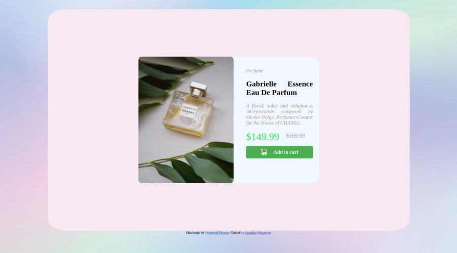
Responsive desing of product page

@Jonathanbees

Desktop design screenshot for the Product preview card component coding challenge

This is a solution for...

  • HTML
  • CSS
1newbie
View challenge

Design comparison


SolutionDesign

Solution retrospective


To make a design, it´s better to use grid or flex design?

Community feedback

Account Deleted

Hello @Jonathanbees👏

Your solution is great✨ and congratulations for successfully completing an another newbie challenge🎉

and there is a small suggestion that might be helpful for you

  • <h1> tag :

It is mandatory to use a <h1> tag in your solution because <h1> tag is most important aspect in accessibility and it helps screen reader to navigate with your page in easy way

And H1 tags also help Google to understand the structure of a page. So if you're using H1s as Google recommends for your page title or content heading, your H1 is effectively telling Google “here's what my page is about.

<Picture> tag :

  • Looks like you used a wrong method to switch images
  • Instead of that you can use <picture> tag
<picture>

<source media="(min-width: 597px)"
srcset="./images/image-product-desktop.jpg ">


<source media="(min-width: 0px)" 
srcset=" ./images/image-product-mobile.jpg">

<img src="./images/image-product-mobile.jpg" alt="Product_image">

</picture>

and also there are a lot aspects where you can improve and I really suggest that you have to take a look of my solution

Hope that was helpful ☺️

Marked as helpful

0
hitmorecode 6,230

@hitmorecode

Posted

Congratulations on your effor. There are a lot of issues with your page.

  • You have used % for a lot of things. If you are not really familiar with % don't use it for now. Wait until your understand it better. % will make your page responsive, but it also can break your page. In you case % is doing more damage than good.
  • When going to small screen size, your page just breaks and this has to do with the use of %. If you give the card a fixed width(px or rem) and height(px or rem) it will work much better. You can give the image height: 100%; and width: 100%; to fill its container. You can also try and use height: inherit; and width: inherit;. What this does is take over the height and width of its parent.
  • If the border-radius is not 50% or 100%, don't use % for border-radius, use px or rem instead.
  • In cases like this when you have a single card on the page it's best to use flexbox to place it in the middle of the page. This will help later with responsiveness.
  • You used font-size: xx-large; and font-size: large; don't use these to define the size of the font, use rem instead. With xx-large or large you cannot control the size of the font, with rem's you can.
body{
background-image: url("./images/fondo.png");
/*  width: 99%; */
min-height: 100vh; /* change it to this */
/* add these lines to place the card in the middle of the page */
display: flex; 
justify-content: center;
align-items: center;
flex-direction: column;
}
.container{
display: flex;
background-color: rgb(247, 232, 242);
/*       margin: auto; */ /* you can remove these two lines */
/*       margin-top: 2%; */
height: 700px;
width: 80%;
border-radius: 5%;
justify-content: center;
justify-items: center;
      
}

.prices{
/*       font-size: xx-large; */
color: rgb(46, 236, 78);
display: flex;
justify-content: space-between;
/*       width: 10%; */
/*       margin: 0; */
}

Don't get discourage by this, these pointer is to make you improve. Your page still needs a lot of work. Try and fix them.

When building a page it doesn't matter if you use flexbox or grid. Use the technology that you feel more comfortable with. If you are more familiar with flexbox use flexbox or if you are more familiar with grid use grid, but it's always good to learn and get familiar with both. There will be occasion where it's easier to build with grid and some occasions where it's easier to build with flexbox.

Marked as helpful

0

@Jonathanbees

Posted

@hitmorecode Thanks for the advices and the possible corrections, i´m still trying to understand better some of css properties and things to implement in the future, and comments like this really helps me with that

i´ll try to implement all the comments that you gave me

Thank you :3

0
Aimal Khan 2,260

@Aimal-125

Posted

You can use both grid and flex-box at the same time for your designs. They are both powerful features.

0

Please log in to post a comment

Log in with GitHub
Discord logo

Join our Discord community

Join thousands of Frontend Mentor community members taking the challenges, sharing resources, helping each other, and chatting about all things front-end!

Join our Discord