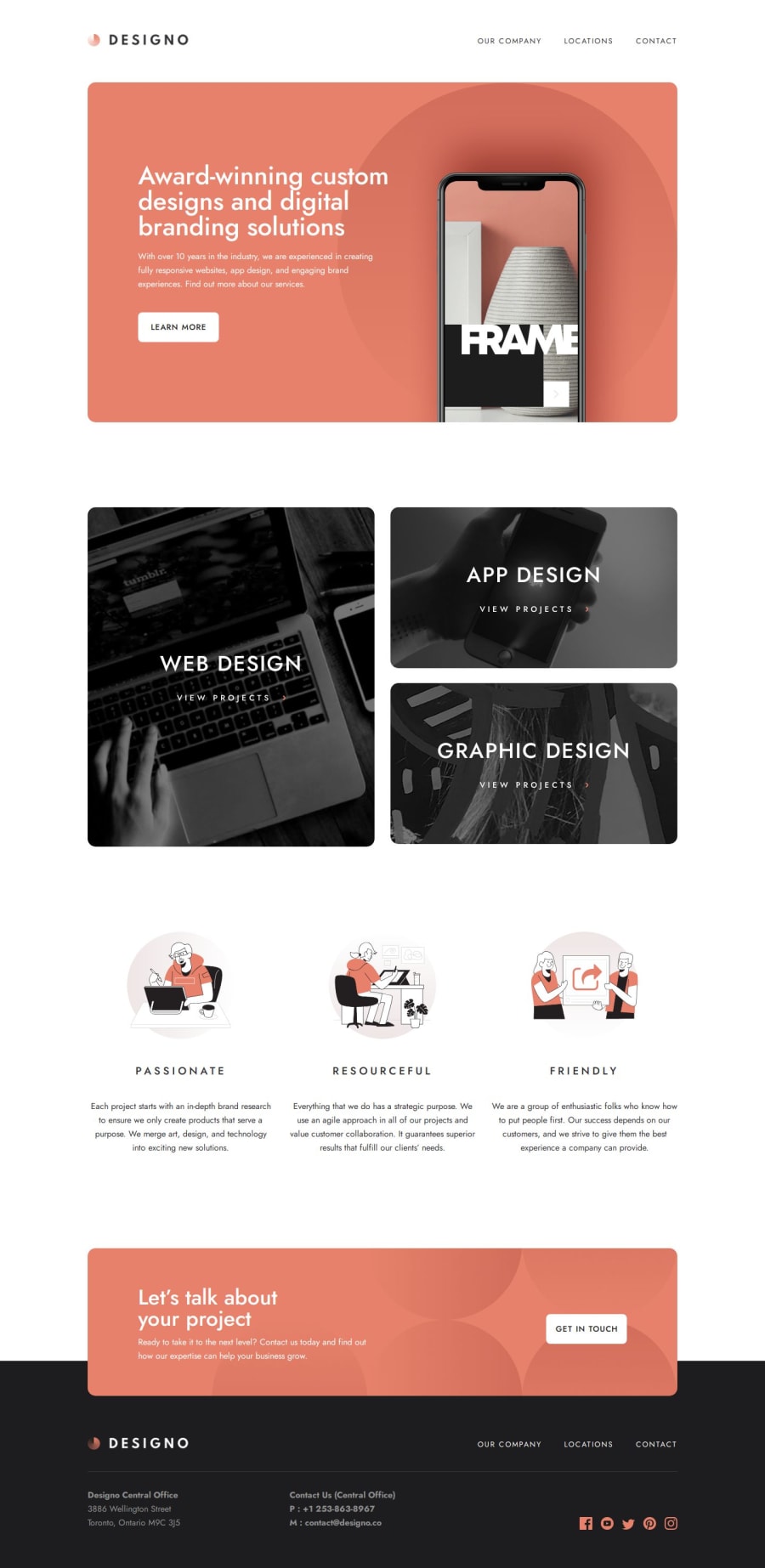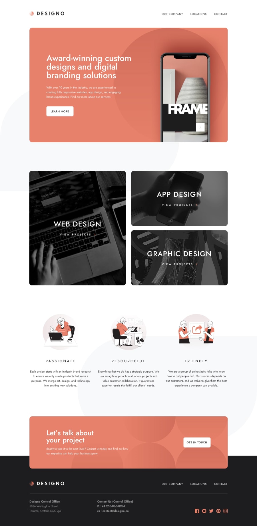
Responsive Designo agency website solution Using React JS & Typescript
Design comparison
Solution retrospective
What I’m most proud of
I'm proud of how I tackled this project by building reusable UI components and optimizing them for different screen sizes. I focused on creating a responsive design that accurately reflects the challenge’s requirements while using modern CSS techniques like Flexbox and Grid to achieve the layout. I also made sure to implement robust form validation, ensuring a seamless experience for users across different device sizes. Additionally, leveraging TypeScript allowed me to keep the codebase clean and minimize bugs by enforcing static types, which contributed to smoother development and maintenance.
What I would do differently next time
If I were to approach this challenge again, I'd invest more time in refining animations and micro-interactions to make the UI even more engaging and intuitive for users. I would also consider implementing unit testing, particularly for reusable components, to catch potential issues early and increase reliability as the project scales. Finally, I would explore accessibility enhancements to ensure the website is fully usable for a wider range of users. This would include a focus on ARIA roles and improved keyboard navigation to enhance the overall user experience.
What challenges did you encounter, and how did you overcome them?Challenges encountered
One of the main challenges I faced was ensuring the design looked consistent across various screen sizes. It required careful consideration of layout adjustments, especially for components with intricate designs like the service pages. I also encountered some complexities with form validation, particularly handling error messages dynamically based on user input, which had to be intuitive and user-friendly. Implementing type safety with TypeScript while ensuring flexibility in the components added another layer of complexity.
How I overcame them
To tackle responsive design, I used a mobile-first approach and leveraged CSS Grid and Flexbox to create a flexible layout that adjusts seamlessly. I spent extra time testing on different devices to ensure the experience was smooth across screen sizes. For form validation, I set up reusable validation functions, making it easier to manage and maintain error messages, and tested edge cases to make sure users received clear feedback. With TypeScript, I incrementally applied types, especially to props and states, allowing me to catch type mismatches early on while retaining flexibility in component usage. These steps made the codebase more robust and adaptable.
Community feedback
Please log in to post a comment
Log in with GitHubJoin our Discord community
Join thousands of Frontend Mentor community members taking the challenges, sharing resources, helping each other, and chatting about all things front-end!
Join our Discord
