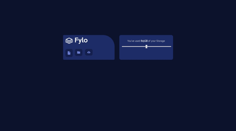
responsive design,flex box,media queris ..newbie
Design comparison
Solution retrospective
Feedbacks please and what you think i should improve....this was a bit hard for me..i had difficulty positioning background image ....
Please log in to post a comment
Log in with GitHubCommunity feedback
- @jiroRi
Quite a nice output you have there considering that you are very new at this!
Some suggestions I have that may be able to help you:
-
it seems like your background image doesn't have the correct path that's why it doesn't load for the preview site. It should be something like
background-image: url(/images/bg-desktop.png);. -
For the 3 buttons, your idea is kinda close but instead of putting most of the styling in the
nav-pic.. you should put them in the parent or its containerdivand add the ff. properties:
display: flex;
justify-content: center;
align-items: center;
and adjust from thereon.. also, your
.nav-picclass should almost only contain properties for the size of the logo itself within the parentdiv.- most of the things in your solution can be improved via learning how to properly utilize
flexbox. There are a lot of awesome websites you can select from in the Resources page where you can dive deeper inflexboxand practice utilizing it.
Still, great job! What matters most is that you never stop learning.. no matter how fast, just keep a steady pace and you will definitely improve.
Keep at it! 💕💪
-
Join our Discord community
Join thousands of Frontend Mentor community members taking the challenges, sharing resources, helping each other, and chatting about all things front-end!
Join our Discord
