

Design comparison

Community feedback
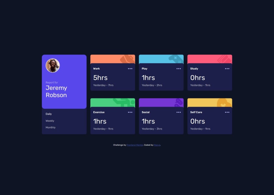
- @khatri2002Posted 2 months ago
Hi! The developed solution looks great! Excellent work on the responsiveness as well! Great job!
Suggestions for Improvement:
1. Equalizing Column and Row Gaps:
If you observe carefully, you'll notice that the row gaps between the cards are larger than the column gaps, which is not consistent with the design reference. Ideally, these gaps should be equal.
- The issue arises because you've applied the
marginproperty directly to the cards in addition to thegapproperty of the grid. - To fix this, remove these margin properties:
.activity-card {
    margin-bottom: 20px;
}

.duration {
    margin-bottom: 20px;
}
Rely solely on the
gapproperty of the grid layout to create equal spacing between the cards:.grid-container { gap: 20px; /* Adjust the value as per design */ }Margins for Mobile Resolutions:
I see why you've used the
margin- it's for when the layout switches toblock(default display) on mobile resolutions. However, margins should only be applied to mobile resolutions, not desktop.Consider using a media query to apply the margin specifically for mobile layouts:
Alternative Mobile Grid Approach:
Instead of switching to
blocklayout on mobile, you could retain the grid layout and adjust it for smaller screens. For example:@media (max-width: 768px) { .grid-container { grid-template-columns: 1fr; /* Single column layout */ grid-template-rows: auto; /* Automatic row height */ gap: 20px; /* Adjust gap for smaller screens */ } }This way, you won’t need the margin at all, and the gap property will handle spacing uniformly across all screen sizes.
2. Use of Semantic Elements:
Currently, you're using an
h4element to render theDaily,Weekly, andMonthlytexts. While this works, it’s not the most semantic choice because these elements perform an action when clicked (changing the view).For interactive elements, a
<button>would be more appropriate:<button class="time-filter">Daily</button> <button class="time-filter">Weekly</button> <button class="time-filter">Monthly</button>Why a
<button>is important:- Buttons are inherently interactive and accessible, making them more suitable for actions like toggling views.
- Screen readers and assistive technologies recognize buttons as actionable elements, improving accessibility for users with disabilities.
- Buttons come with built-in keyboard navigation support (e.g., pressing "Enter" or "Space"), which improves the overall user experience.
The solution already looks solid! These tweaks will elevate it even further! Great work, and keep it up! 🚀
Marked as helpful0 - The issue arises because you've applied the

Please log in to post a comment
Log in with GitHubJoin our Discord community
Join thousands of Frontend Mentor community members taking the challenges, sharing resources, helping each other, and chatting about all things front-end!
Join our Discord