Submitted 6 months ago
Responsive Design with SCSS, Semantic HTML, and CSS Grid
#accessibility#sass/scss

@MrLanter

Design comparison
SolutionDesign

Solution retrospective
What are you most proud of, and what would you do differently next time?
I managed to use CSS grid to create this layout, which was not easy for my first time.
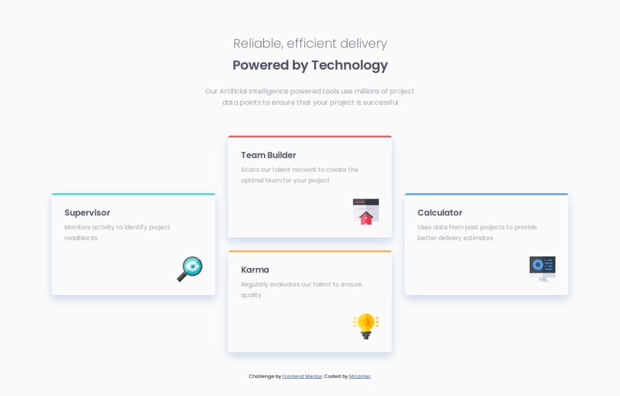
What specific areas of your project would you like help with?- Does the project look like the design?
- Are the image files and fonts well optimized?
- Is accessibility well used?
Any other recommendation is welcome!
Community feedback
Please log in to post a comment
Log in with GitHubJoin our Discord community
Join thousands of Frontend Mentor community members taking the challenges, sharing resources, helping each other, and chatting about all things front-end!
Join our Discord