Design comparison
SolutionDesign
Solution retrospective
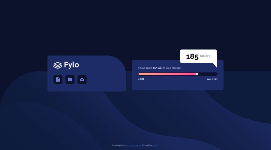
I used pseudoelements here to create the inverted triangle for the "dialog bubble" that is only present in the desktop layout. Like this:
.content-highlight:after {
    content: "";
    background-color: white;
    width: 30px;
    height: 30px;
    position: absolute;
    bottom: -25px;
    right: 0px;
    clip-path: polygon(100% 0, 12% 0, 100% 100%);
  }
Is clip-path the right way to achieve this here? Could not find an easier way to create a triangular shape. First time doing this! feedback more than welcome!
Community feedback
Please log in to post a comment
Log in with GitHubJoin our Discord community
Join thousands of Frontend Mentor community members taking the challenges, sharing resources, helping each other, and chatting about all things front-end!
Join our Discord
