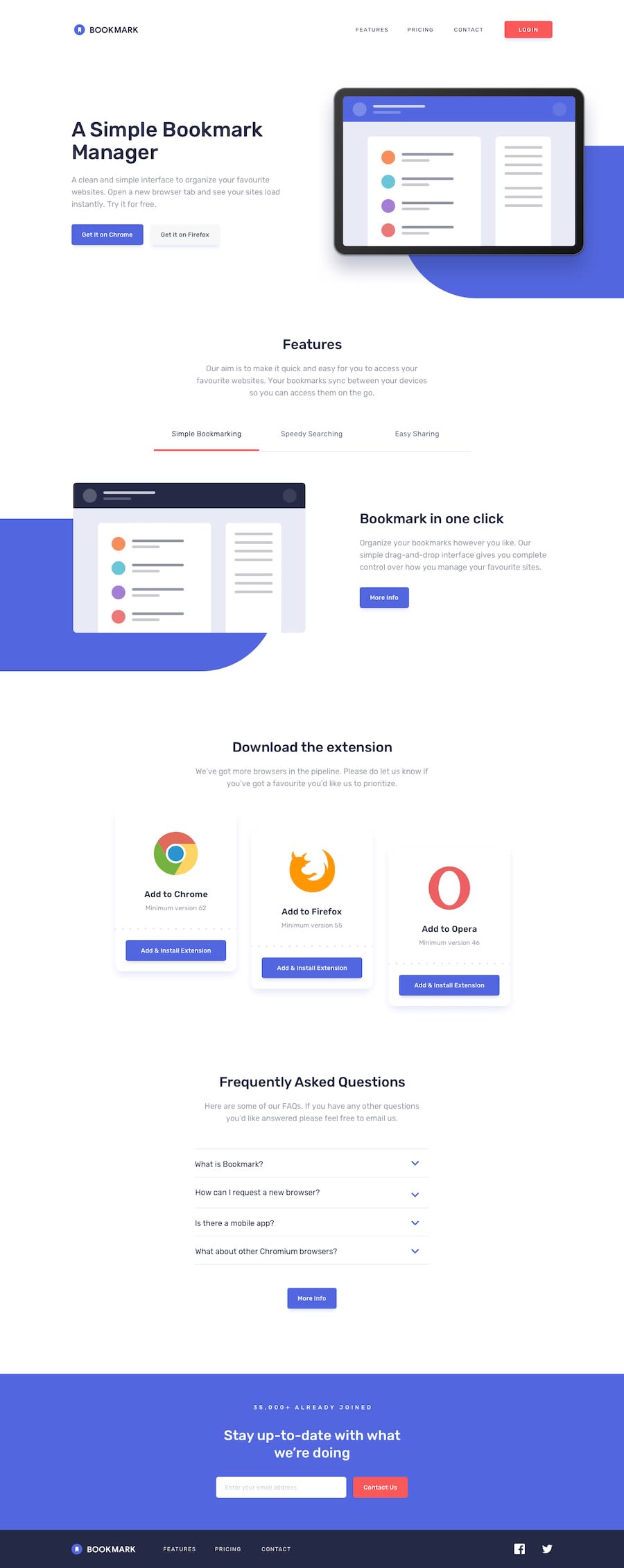
Design comparison
SolutionDesign
Solution retrospective
Any comment or suggestion are always welcome.
Community feedback
- @Mennatallah-HishamPosted about 1 year ago
Hi Ehtesham,
I have some little tips to improve your code:
- add alt to <img>
- ids should be unique
- use <article> for cards instead of <section>
- add meta description for better SEO
- Heading elements should be used sequentially, you shouldn't skip levels.
- use <p> instead of h3 <h3 class="joinedheading">35,000+ already joined</h3>
- there should be only one <h1> tag in a page
<h1> simple bookmark manager </h1>

<h2> Features </h2>

 <h2> download extension</h2>

 <h2>FAQ </h2>

 <h2> stay up to date</h2>
Hope you find this helpful
Marked as helpful1@Ehteshamali-889Posted about 1 year ago@Mennatallah-Hisham thanks for such feedback. From next time i will try to follow suggestions mentioned. Thanks for your time.
1
Please log in to post a comment
Log in with GitHubJoin our Discord community
Join thousands of Frontend Mentor community members taking the challenges, sharing resources, helping each other, and chatting about all things front-end!
Join our Discord
