Responsive design with Flexbox, media queries and sources


Design comparison

Solution retrospective
I'm proud of using HTML media queries instead of using it on CSS.
the website is better optimized in this way and easier to load.
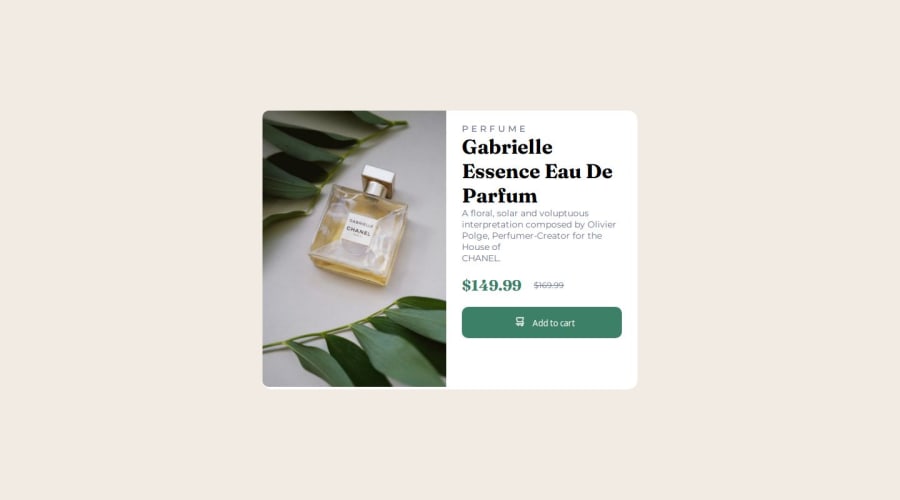
What specific areas of your project would you like help with?I'm facing a problem that i don't know exactly why... but there is a tiny margin on the bottom of the image on desktop design
what i already tried: applying "height: 100%" on the img applying "height-fit-content" on the card removing the <p> from HTML to test if the content was making it bigger for any reason
nothing worked until now
Community feedback
- @synnestormPosted 6 days ago
Hi! Nice work :)
The reason why you have a tiny margin on the bottom of the image is because the:
<div class="card">
has a white background and have a
width: 600px; and height: 445.52px;
If you go into your CSS, just add a width and a height to your div .card.
Good luck :)
Marked as helpful0

Please log in to post a comment
Log in with GitHub
Join our Discord community
Join thousands of Frontend Mentor community members taking the challenges, sharing resources, helping each other, and chatting about all things front-end!
Join our Discord