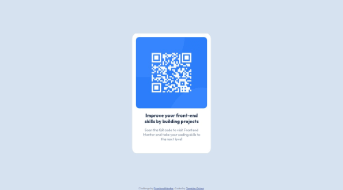
Design comparison
SolutionDesign
Solution retrospective
This is a new attempt at solving this challenge...
Community feedback
- @fernandolapazPosted over 1 year ago
Hi π, in case you want to take a look:
HTML π§±:
- The main content of every page (the card in this case) should be wrapped with the
<main>
tag.
CSS π¨:
- You might consider using some CSS reset as a good practice at the start of each project, to have a clean starting point and reduce differences between browsers. A popular CSS Reset from Josh Comeau π
For example, these are some very common and useful ones:
*, *::before, *::after { box-sizing: border-box; margin: 0; padding: 0; } picture, img, svg { display: block; max-width: 100%; }
- Length units such as pixels may not be the best alternative because absolute units donβt scale. Relative units like rem or em are a better option for scalable layouts (the page will adjust to the user's browser settings) and maintenance (to make changes without having to adjust every pixel value).
- You don't need to use
font-weight
of 400 and 700 as these are the default values for normal and bold fonts. So, these are the default values for paragraphs and headings.
Please let me know if you want more info on any of these topics or disagree with something. I hope itβs useful π
Regards,
Marked as helpful0 - The main content of every page (the card in this case) should be wrapped with the
Please log in to post a comment
Log in with GitHubJoin our Discord community
Join thousands of Frontend Mentor community members taking the challenges, sharing resources, helping each other, and chatting about all things front-end!
Join our Discord