Submitted 20 days ago
Responsive design utilizing grid and flex

P
@Chanokthorn

Design comparison
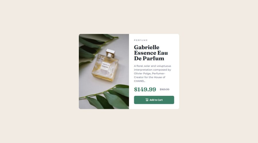
SolutionDesign

Solution retrospective
What are you most proud of, and what would you do differently next time?
- Handling responsive layout on initial steps can help with managing styling in the long run.
- Defining which component are similar between all screens helps with grouping components together for reusability.
I'm curious how we usually handle sizing in these scenarios:
- Mobile: It appears that size of image and card information determines the size of the card.
- Desktop: The size of card information should determine the size of card, but having child component determine size of parent seems like a complex practice, what's the appropriate approach?
Community feedback
- @chryspenalberPosted 19 days ago
I would suggest you to use flexbox instead of grid template in this case.
1P@ChanokthornPosted 18 days ago@chryspenalber Thanks for the feedback, your approach on using flex seems like a good way to go. I’ll try that the next time!
1

Please log in to post a comment
Log in with GitHub
Join our Discord community
Join thousands of Frontend Mentor community members taking the challenges, sharing resources, helping each other, and chatting about all things front-end!
Join our Discord