Submitted over 2 years ago
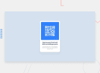
Responsive design using position relative/absolute
@DinahNovema
Design comparison
SolutionDesign
Community feedback
- @AbdallaRahmahPosted over 2 years ago
nice work Dinah, i recommend you to use flexbox insted of position to center elements, also you use the box-shadow property to add nice look to the box.
0
Please log in to post a comment
Log in with GitHubJoin our Discord community
Join thousands of Frontend Mentor community members taking the challenges, sharing resources, helping each other, and chatting about all things front-end!
Join our Discord

