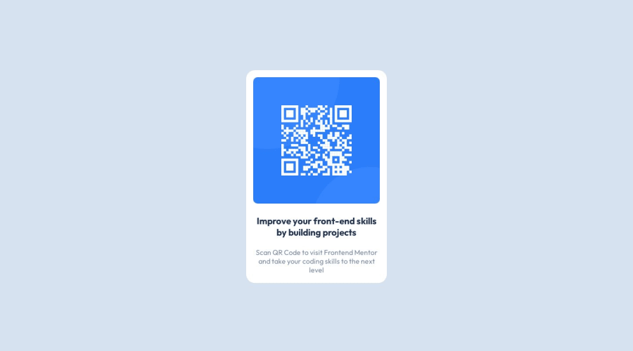
Design comparison
Community feedback
- @tamasgazdikPosted over 1 year ago
Good job on completing the challenge! A couple of tips that could be beneficial in the long run:
index.html
- use
mainelement instead of<div class="main">.mainhas actual semantic meaning and therefore better in terms of accessibility.divdoesn't have any semantic meaning whatsoever - since the content within the
<h3>is the only title, you can instead include it in<h1>and then style it as you'd like it to appear
style.css
- at
bodyselector addingmin-height: 100dvh;is generally a good idea, since for mobile devices it takes into account different controls, that might pop in during scrolling (you know, that button triplet - background apps, exit to start screen of mobile, go back, or the address bar at the top) - middle part can be positioned centrally by setting
display: flex;andjustify-content: center;on thebody, thenmargin: auto;on the.main position: relative;is unnecessary for theimg, as you don't specify either top, bottom, left, or rightpadding: 1px 20px;- 1px is basically invisible, that can be removed. If you want to do padding only on left and right side, you can instead do:padding-inline: 20px;(for setting top and bottom padding you can dopadding-block: 20px;)- also the style-guide.md specified the paragraph font-size to be 15px. Since by default most browsers use 16px, setting
font-size: 0.9375rem;onpshould do the trick.
Once again, great work, good luck going forward! :)
Marked as helpful0 - use
- @0xabdulkhaliqPosted over 1 year ago
Hello there 👋. Congratulations on successfully completing the challenge! 🎉
- I have other recommendations regarding your code that I believe will be of great interest to you.
QR iMAGE ALT TEXT 📸:
- Since this component involves scanning the QR code, the image is not a decoration, so it must have an
altattribute.
- The
altattribute should explain the purpose of theimage.
- E.g.
alt="QR code to frontendmentor.io"
<img src="/images/image-qr-code.png" alt="QR code to frontendmentor.io">
.
I hope you find this helpful 😄 Above all, the solution you submitted is great !
Happy coding!
Marked as helpful0 - @Kamlesh0007Posted over 1 year ago
Congratulations on completing the challenge! That's a great achievement, and I'm sure you put a lot of effort into it. I really liked the way you approached the challenge and the code you wrote. You demonstrated a good understanding of the concepts and applied them effectively to solve the problem.I have a few suggestions to improve your code further. When it comes to centering a div or any element on a webpage, using margins may not always be the best approach. so use flexbox or grid layout for centering the div. make the container center properly use min-height:100vh which is used to ensure that a container or element takes up at least the full height of the viewport (the visible area of the browser window) regardless of the content inside it.
Here's an example code snippet:
body {
display: flex;
min-height:100vh;
align-items: center;
justify-content: center;
}

now remove below lines of code
.main {
margin: 10rem auto;
}
Marked as helpful0
Please log in to post a comment
Log in with GitHubJoin our Discord community
Join thousands of Frontend Mentor community members taking the challenges, sharing resources, helping each other, and chatting about all things front-end!
Join our Discord
