Design comparison
Solution retrospective
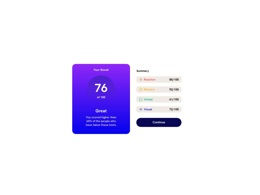
Focusing on responsive design development for different layouts dimensions Any remarks or tips will be appreciated.
Community feedback
- @Zy8712Posted about 1 year ago
Your site looks pretty good. A couple things I think you could add/modify is:
- a
maintag to wrap around your page contents (for accessbility purposes) - making the background of each result (Memory, Reaction, Verbal, Visual) match their assigned colour. This can be done by making the background of each one equal to the font-colour and then reducing the opacity using the
opacitycss property.
Aside from that your code looks pretty organized. Nice work!!
Marked as helpful1@kimodev1990Posted about 1 year ago@Zy871 Thanks for your feedback and really appreciate your encouragement words.
0 - a
- @MelvinAguilarPosted about 1 year ago
Hello there 👋. Good job on completing the challenge !
-
Your implementation of mobile-first design is great! However, to improve your code, it's recommended to avoid duplicating styles between the code outside and inside the media query. Utilize the media query to override and modify existing values without repeating the entire block.
For example:
.boxes {
  display: flex;
  justify-content: space-between;
  background-color: rgb(240, 234, 228);
  padding: 0 15px;
  border-radius: 10px;
  width: clamp(110px, 90vw, 300px);
}

@media (min-width: 376px) {
  .boxes {
    width: clamp(50px, 35vw, 250px);
  }
}
I hope you find it useful! 😄
Happy coding!
Marked as helpful1@kimodev1990Posted about 1 year ago@MelvinAguilar Thanks for your remarks, Really appreciated man !
0 -
Please log in to post a comment
Log in with GitHubJoin our Discord community
Join thousands of Frontend Mentor community members taking the challenges, sharing resources, helping each other, and chatting about all things front-end!
Join our Discord
