Design comparison
SolutionDesign
Solution retrospective
What are you most proud of, and what would you do differently next time?
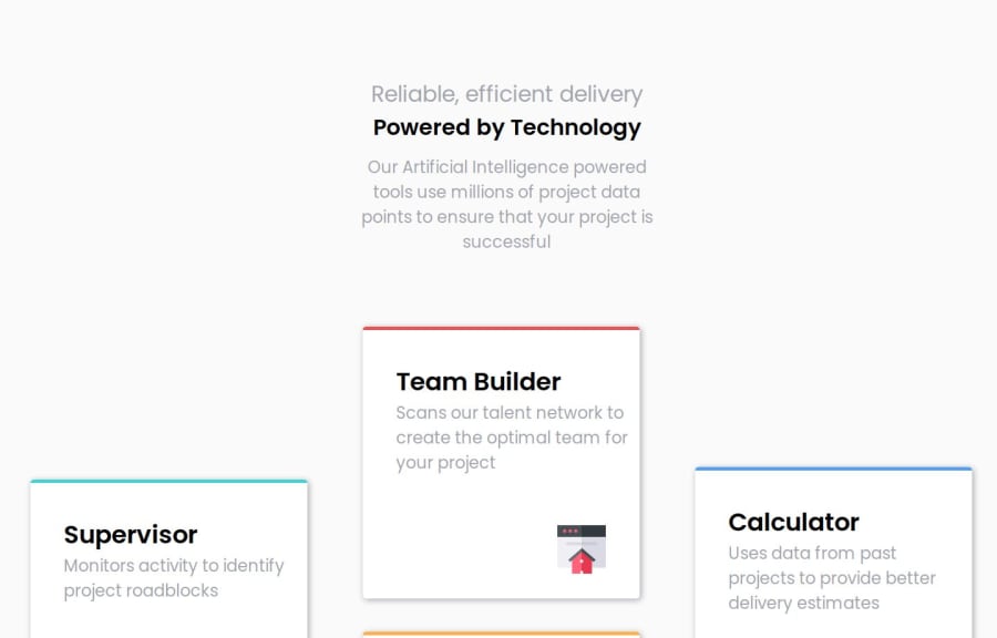
This time i did use both Grid and Flexbox in my design, for main layout i used Grid and four inner Card layout i used Flexbox, i think which is a good way of doing layout
What challenges did you encounter, and how did you overcome them?I struggled to position my image in card , howevery latter i learned that it was quite easy by child property of align self
What specific areas of your project would you like help with?I think , i need help on breakpoints at what pixel widht should i add breakpoints in my design and further when screeen size get larger , i see a lot of white space in middle of my cards.
Community feedback
Please log in to post a comment
Log in with GitHubJoin our Discord community
Join thousands of Frontend Mentor community members taking the challenges, sharing resources, helping each other, and chatting about all things front-end!
Join our Discord
