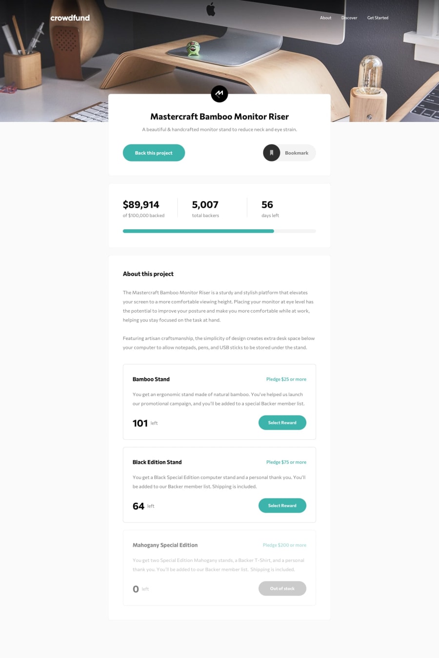
Responsive design using Flexbox and Grid, SCSS, React
Design comparison
Solution retrospective
Took me a while to figure this one out, but I enjoyed the challenge! I did this challenge to improve on my React skills, specifically how to manage states between components. Although I did learn a lot from this project, I still have a few things that I'm uncertain about:
-
If there are a lot of states that we have to pass through different components, do we really have to pass each state through every single component along the path to the component where the states are needed? This is what I practiced in this project and I found that the props for each component can end up becoming extremely long. Is there a way to shorten it?
-
How do I know if a certain element deserves to be its own component? The way I currently do it is, if the element is repeated throughout the site, I turn it into its own component so I don't have to repeat myself, but I'm open to more advice in order to make my code more organized!
-
Is there a naming convention for the class names that are given to React components and is their a way of organizing the styles for each component? I usually follow the BEM CSS naming convention and place all the styles I have in one scss file but I noticed that it's gotten extremely lengthy. Is there a better way to organize?
Any comments and advice are more than welcome!
Community feedback
Please log in to post a comment
Log in with GitHubJoin our Discord community
Join thousands of Frontend Mentor community members taking the challenges, sharing resources, helping each other, and chatting about all things front-end!
Join our Discord
