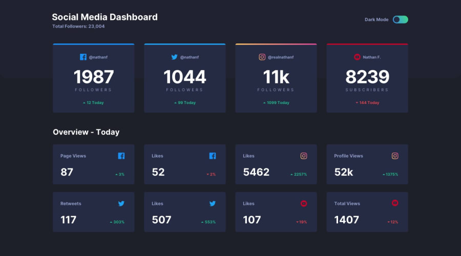
Design comparison
SolutionDesign
Community feedback
- @Kamasah-DicksonPosted over 2 years ago
Am glad to see a solution from you again.
- your solution looks great and closer to the design.
- It is also responsive on smaller devices.
To help you with the accessibility issues.
- Always remember not to leave the alt attribute on an image empty. You should always provide an alt . because it is very helpful for screen readers.
Besides good job there👍 See you again in your next project👍💻
Marked as helpful1@RamiGamalMahmoudPosted over 2 years ago@Kamasah-Dickson And I am so glad to see your helpful comments. Thank you :)
1
Please log in to post a comment
Log in with GitHubJoin our Discord community
Join thousands of Frontend Mentor community members taking the challenges, sharing resources, helping each other, and chatting about all things front-end!
Join our Discord
