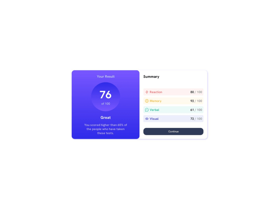
Design comparison
Solution retrospective
Hi Everyone, I am a beginner in front-end website development. I try to write clean code. Any feedbacks are most welcome regarding the ui or codebase.
Thanks! Have a great day :)
Community feedback
- @mseidel819Posted over 1 year ago
I think you could add a media query so that the
height: 100vhon the body only appears on large screens. It is causing some issues with the box shadow overlapping content on mobile.Another little bonus: you could add
cursor: pointerto your.continue-btnclass to signal that the button is clickable(even though its not connected to anything for this challenge). also, you could add a:hovereffect on the button for more interactivity. Maybe a slightly lighter color, or an opacity?.continue-btn:hover{ opacity: .8; }Marked as helpful1@shiwanhs05Posted over 1 year ago@mseidel819 Thank you for suggesting all these improvements. The site is live with these improvements. Any more suggestions are very much appreciated. https://resultsummary-second-assignment.netlify.app/
0
Please log in to post a comment
Log in with GitHubJoin our Discord community
Join thousands of Frontend Mentor community members taking the challenges, sharing resources, helping each other, and chatting about all things front-end!
Join our Discord
