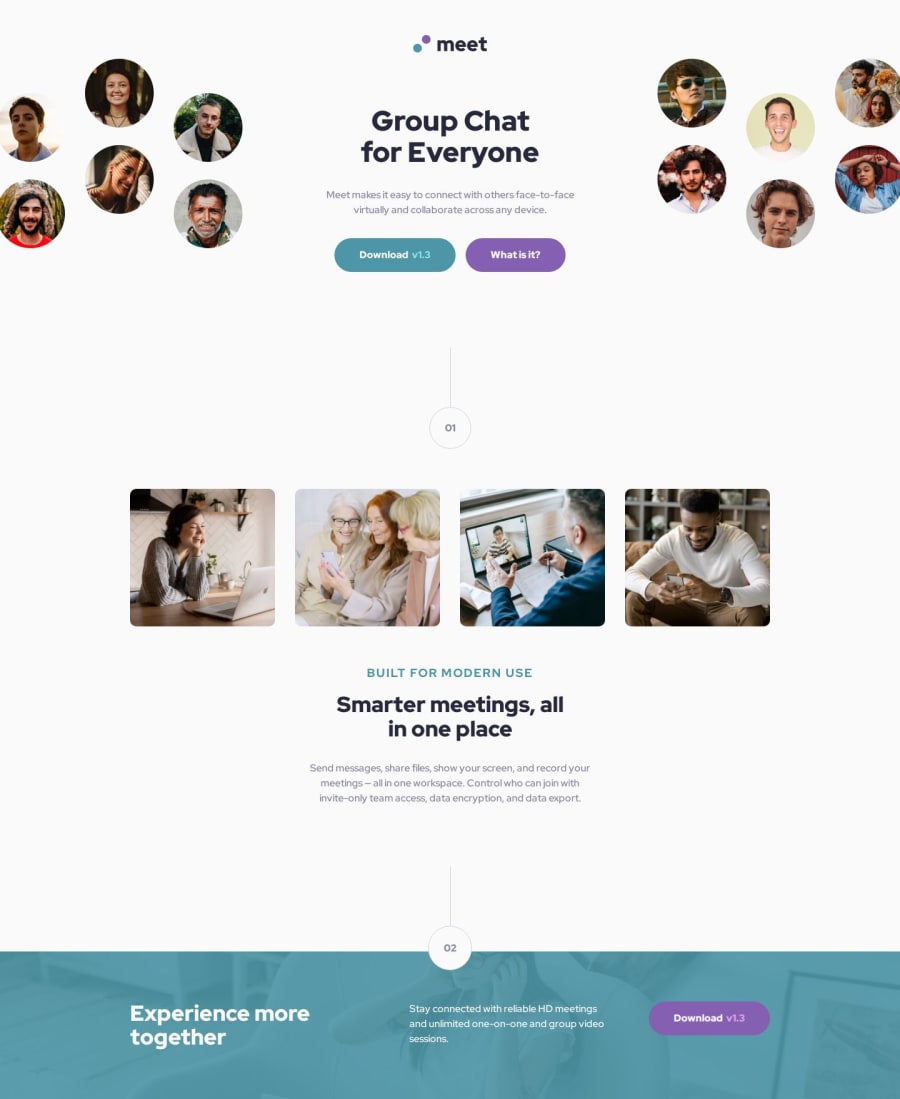
Design comparison
Solution retrospective
Most of what I used in this project was stuff I have already known. Some new things I tried was how changing the color of the buttons on their hover and active states using filters, instead of hard-coded colors. There was also a version number in the buttons that was a slight tint of the background of each button. I thought it would save some lines of code if I just had the tint dynamically change based on the background, instead of having to manually enter a tint value. I did this by using mix-blend-mode for the text, which was something I didn't know about until this project. Using overlay with a 75% opacity really helped with this effect.
What challenges did you encounter, and how did you overcome them?I feel like I used a lot more CSS than what may have been necessary. I tried to go for a mobile-first approach again, and started with the smallest screen size design. The transition from that to tablet was actually quite easy, but from tablet to desktop became more of a challenge.
The hardest part for me was turning the single image of the circles in the header. In mobile and tablet it was quite simple, but then it splits into two different images that surround the text in desktop mode. The hard part for me was creating the transition from tablet to desktop, and then managing the look of the split images while keeping it compatible with the tablet and mobile mode. I feel like I got a working solution that looks good, but I don't know if my implementation is very effecient.
Join our Discord community
Join thousands of Frontend Mentor community members taking the challenges, sharing resources, helping each other, and chatting about all things front-end!
Join our Discord
