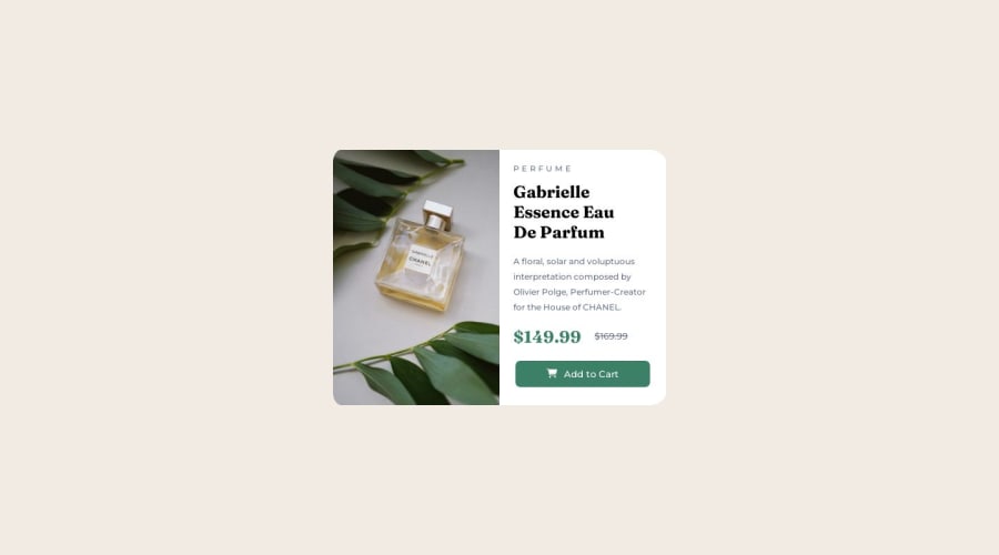
Design comparison
SolutionDesign
Solution retrospective
Hello there!
Here my third challenge finished. I keep learning and each time I understand a bit more.
Any suggestions are welcome!
Respectfully,
Qx
Community feedback
- @0xabdulkhaliqPosted over 1 year ago
Hello there 👋. Congratulations on successfully completing the challenge! 🎉
- I have other recommendations regarding your code that I believe will be of great interest to you.
HTML 🏷️:
- This solution contains some minor semantic issues which may cause lack accessibility
- The
<h3>PERFUME</h3>, must want to be changed to normal case likePerfume
- Providing uppercase letter to them is not a good practice and the screen reader will read it as letter by letter like
P,E,Retc.
- Don't worry we can use
text-transform: uppercaseto transform the letter andletter-spacing: 1remfor the textPerfume
- And another thing that the old price is not being properly announced, you have used
spanelement for that.
- Actually there's a native html element which comes handy in these situations. it is
delelement
- So you can use like this
<del>$169.99</del>
- These are the tips which improves the accessibility in real world situations.
- If you have any questions or need further clarification, you can always check out
my submissionand/or feel free to reach out to me.
.
I hope you find this helpful 😄 Above all, the solution you submitted is great !
Happy coding!
Marked as helpful0@quijotexPosted over 1 year ago@0xAbdulKhalid thank you for your suggestions! I find them very helpful. I'm going to include them in my code.
0
Please log in to post a comment
Log in with GitHubJoin our Discord community
Join thousands of Frontend Mentor community members taking the challenges, sharing resources, helping each other, and chatting about all things front-end!
Join our Discord
