Design comparison
SolutionDesign
Solution retrospective
What are you most proud of, and what would you do differently next time?
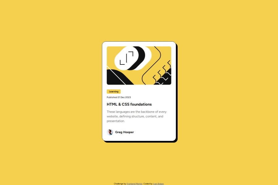
Using gap when trying to create spacing between the card sections. Also proud of easily exporting the box-shadow from Figma.
What challenges did you encounter, and how did you overcome them?Using box-sizing: border-box in order to preserve the height and width of the card instead of the sizing being affected by it.
What specific areas of your project would you like help with?Organising my css, when it comes to component styling. Something like first define the Box model, then colors, then special effects.
Community feedback
Please log in to post a comment
Log in with GitHubJoin our Discord community
Join thousands of Frontend Mentor community members taking the challenges, sharing resources, helping each other, and chatting about all things front-end!
Join our Discord
