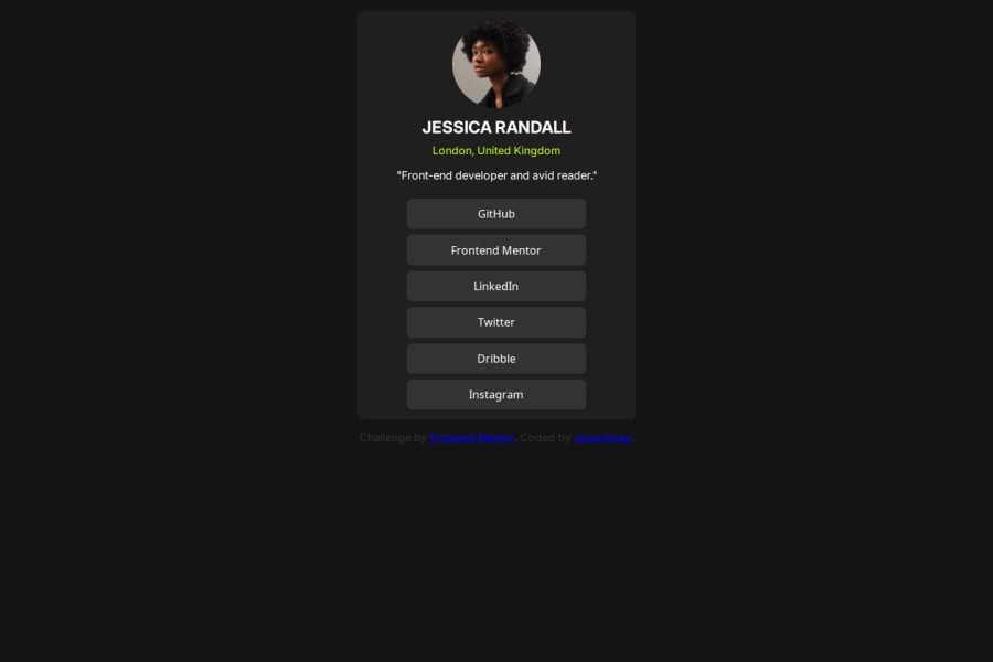


Design comparison

Solution retrospective
I am proud of the output, and the ability to learn new concepts and apply them in projects like this.
What challenges did you encounter, and how did you overcome them?I had a little challenge with the hover coverage but I was able to tweak it to apply the coverage to the extent I wanted.
What specific areas of your project would you like help with?I would love a review
Please log in to post a comment
Log in with GitHubCommunity feedback
- @Knight9876
Well, you wanted a review huh? It's nice, seriously. It's just the card which is not in the center makes it kinda sus. Lol
Haven't you tried this: position: absolute; left: 50%; right: 50%; transform: translate(-50%, -50%);
try this, this will definitely center it. Use this css on the class which you used to name the card. if this doesn't work, make sure the parent class has "position: relative", but this works without relative. Try it just once.
Oh, and for the hover effect, i don't know what you did that made it challenging but its simple.
Try this class-name:hover { color: hsl-color-code; }
I guess this works Hope this review helps you.
ALL THE BEST!!! (THUMBS UP)

Join our Discord community
Join thousands of Frontend Mentor community members taking the challenges, sharing resources, helping each other, and chatting about all things front-end!
Join our Discord