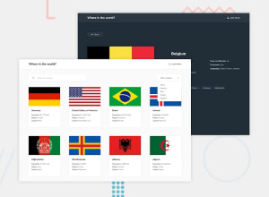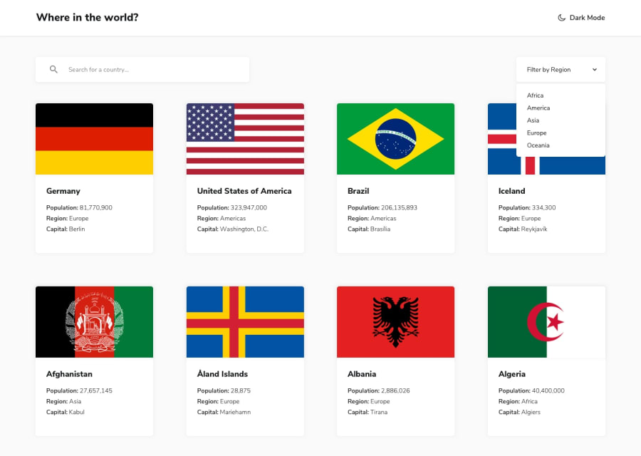
Design comparison
SolutionDesign
Solution retrospective
Mi primer proyecto con react, cualquier comentario para construir se les agradece ... :)
Community feedback
- @carlwickerPosted almost 3 years ago
Great job on the layout however there are a few things missing from the design specifications.
- Add a drop shadow the country cards, this will give them a clearer outline on the light mode.
- The search and filter does not work correctly, the search works globally but not if the country filter is applied.
- I'd consider making the whole filter dropdown clickable to ease accessibility.
- Bordering countries on the details page currently shows the country code, it should be the full country name. To achieve this you will need to re-query the API.
Keep up the great work.
Marked as helpful0
Please log in to post a comment
Log in with GitHubJoin our Discord community
Join thousands of Frontend Mentor community members taking the challenges, sharing resources, helping each other, and chatting about all things front-end!
Join our Discord
