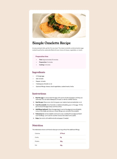
Responsive Design - Recipe Page

Solution retrospective
I initially submitted this on Thursday - few days ago but the scaling wasn't up to date, so I wanted to redo the project. I'm proud that I didn't give up on this - this one was probably the most detailed project I did so far..
What challenges did you encounter, and how did you overcome them?I understimated this project really badly. Looking at the projects I did in the past this actually looked easy in my eyes. It wasn't - atleast for me it wasn't. -I struggled with making a table on the bottom of the page; -I have to definetly refresh on my Semantic HTML - using main & picture its definetly not enough; -I looked at the design they made for 375px but I do not have a device like that so I went with 430px+ so I can actually see the mobile version of this on my phone.
- scaling was also an issue, had to go over this project again.
- Semantic HTML
- Scaling, will have to start using Ems and rems,
- Any comments and suggestions are more than welcome.
Please log in to post a comment
Log in with GitHubCommunity feedback
No feedback yet. Be the first to give feedback on Dan P.'s solution.
Join our Discord community
Join thousands of Frontend Mentor community members taking the challenges, sharing resources, helping each other, and chatting about all things front-end!
Join our Discord