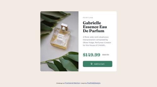
Submitted over 1 year agoA solution to the Product preview card component challenge
Responsive Design Product Preview Card
@fivetailsdevelopment

Solution retrospective
What are you most proud of, and what would you do differently next time?
Very happy with how this turned out without using Figma design files.
Also happy with how easy it was to adjust from a mobile-first build.
Want to explore better use of custom variables for streamlining media query changes and making it easier for others to understand the code.
What challenges did you encounter, and how did you overcome them?I had some issues with sequencing and synchronicity - some of the media queries weren't taking effect. This was solved by moving the media query to the end of the CSS file.
Code
Loading...
Please log in to post a comment
Log in with GitHubCommunity feedback
No feedback yet. Be the first to give feedback on James's solution.
Join our Discord community
Join thousands of Frontend Mentor community members taking the challenges, sharing resources, helping each other, and chatting about all things front-end!
Join our Discord