Responsive Design Porfolio - React - StyledComponents - Swiper.js
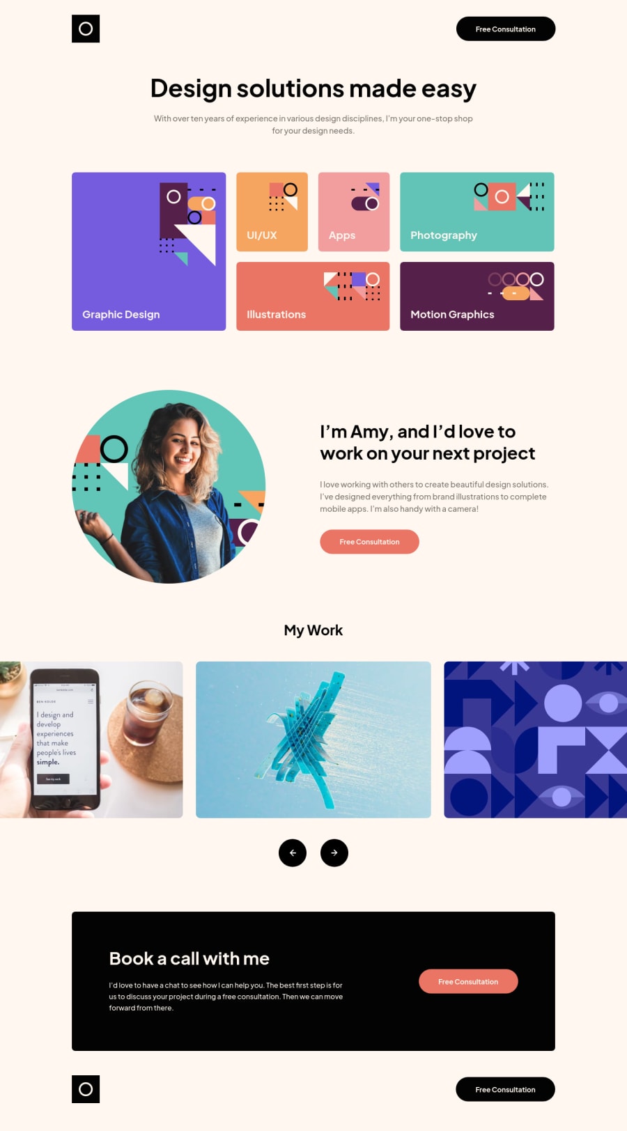
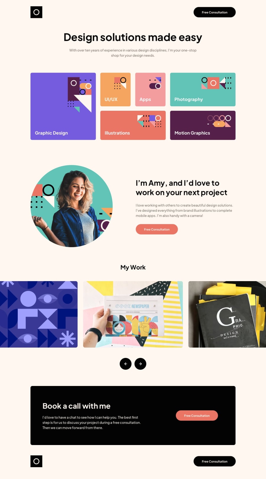
Design comparison
Solution retrospective
Hello and welcome to my Design Portfolio Solution
This challenge was pretty much a CSS full practice.
Features of the Solution:
- Resources I used:
-
Create React App: Maybe you can think that is probably over-kill, but in this case, I want to practice my CSS with styled-components, this challenge can be purely done with HTML, CSS and JS.
-
Styled-components: As I said in the previous paragraph, I am trying to practice my styled-components skills, also trying to improve my CSS.
-
CSS Grid: For the design skills layout, I think is the best possible solution to do it!
-
Flex-box: For making it a more easy-responsive project, the containers are all flexbox, except some cases that are done with CSS Grid.
-
Swiper.js: For the sliders I did use a external Library called Swiper.js, making it more easy to build sliders and also has support for almost every framework!, I did create 3 different slides for each breakpoint (Mobile: Cube effect, Tablet: Pagination effect and Desktop: Normal Slider), you can check more info of this components on my README.md file
- Breakpoints:
- 375px for Mobile
- 768px for Tablet
- 1440px for Desktop
Questions to FEM community:
- I would really appreciate if you can test the page and test the UI breakpoints and the Slider, If you have any suggestions, I would try to implement them if possible!
- ¿Do you think the cube effect is good for mobile devices?, ¿Would you stick to the challenge sliders or maybe use another kind of effect?.
If you want to checkout more info about this project, checkout the GitHub repository and the README.MD file
As always, any feedback is welcome
Community feedback
Please log in to post a comment
Log in with GitHubJoin our Discord community
Join thousands of Frontend Mentor community members taking the challenges, sharing resources, helping each other, and chatting about all things front-end!
Join our Discord
