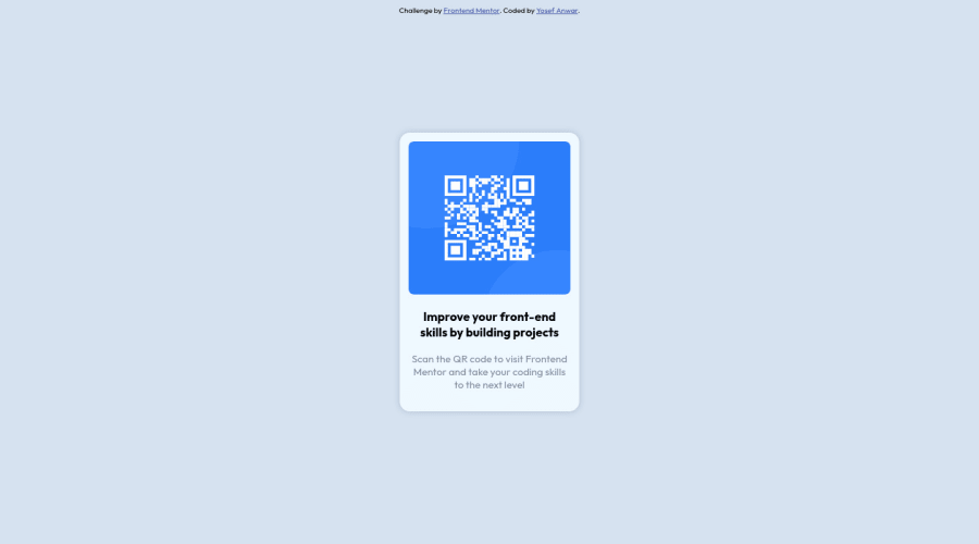
Design comparison
Solution retrospective
This one was quite easy but I'm still unsure of what is the "right" way of responsive designing. Like how can I tell that this will work on mobile screens or not. Thank you for your feedback in advance
Community feedback
- @superschoolerPosted over 2 years ago
Hi Yosef, great job! The easiest way to tell if it works on all screen sizes is to open developer tools (right click the webpage then select Inspect) and then slide the pane horizontally to compress and enlarge the site. If you hit a point where text overflows or it looks bad, you can use media queries or change other properties to fix it.
Marked as helpful0@YosityPosted over 2 years ago@superschooler I thought about it and realized that it'll be hard to adjust the design based on different device screen, for example: The supposedly phone screen size we were given is 375px, my iphone screen was bigger than that so it displayed the desktop design but it was chaotic for some reason. I hope you get what I'm trying to say, do you have any solutions for this ?
0@superschoolerPosted over 2 years ago@Yosity with this project responsiveness isn't really an issue because it's smaller than any phone screen out there today, and it looks fine on a desktop as well. If, for example, you had three of these QR codes side by side, it would cause an issue on cell phones because you'd have to side-scroll to see them all. In that case, you could simply put them all in a flexbox container so they stack vertically on smaller devices instead of causing side-scrolling.
For yours, once you hit a width of 382px or smaller, there's a tiny bit of side scrolling (is that what you mean by chaotic?). The cause of that would be the min-width on your body of 375px. If you removed that you wouldn't have side scrolling until 307px or smaller because of the width of the frame. The iPhone 13 Mini is 375px wide, so I wouldn't worry about that one.
0@YosityPosted over 2 years ago@superschooler Hm by chaotic I meant image stretching, text goes all over basically the design gets ruined. But yeah since the QR code is small it shouldn't be an issue, but I wanted to know for the upcoming big sized projects. i have been searching the internet and they dont really answer my question which is "how to design so it fits all screens ?". I think media query is a solution but we got tons of screen sizes so...
0@superschoolerPosted over 2 years ago@Yosity Can you upload a screenshot to GitHub and share it so I can see what you mean?
0@YosityPosted over 2 years ago@superschooler https://github.com/Yosity/Product-preview-card-component.git Screenshot 2022-07-02 212533.png and WhatsApp Image.....
0
Please log in to post a comment
Log in with GitHubJoin our Discord community
Join thousands of Frontend Mentor community members taking the challenges, sharing resources, helping each other, and chatting about all things front-end!
Join our Discord