Not Found
Not Found
Not Found
Not Found
Not Found
Not Found
Not Found
Not Found
Not Found
Not Found
Not Found
Not Found
Not Found
Not Found
Not Found
Not Found
Not Found
Not Found
Not Found
Not Found

Submitted

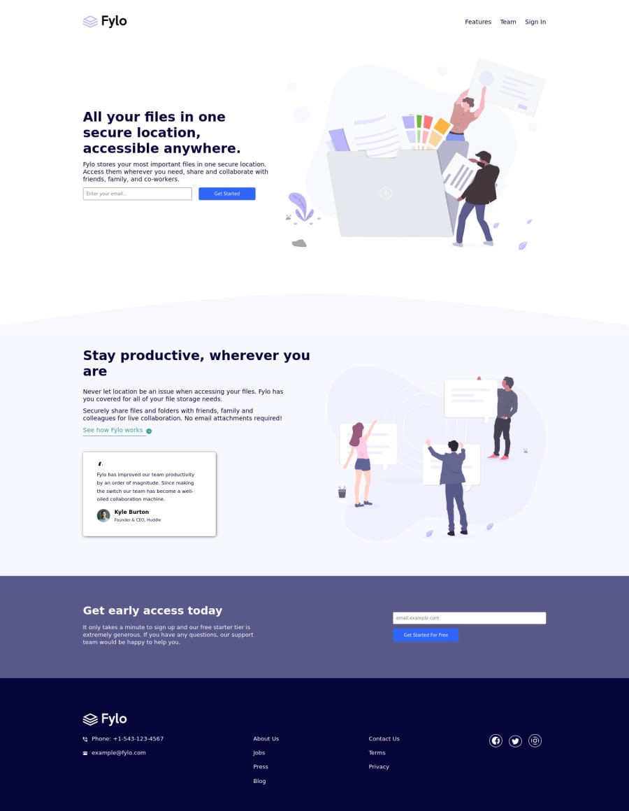
Responsive design of a Fylo Landing Page

@Tunde-webdev

Desktop design screenshot for the Fylo landing page with two column layout coding challenge

This is a solution for...

  • HTML
  • CSS
2junior
View challenge

Design comparison


SolutionDesign

Solution retrospective


I need suggestions/tips on adding hover effects to icons/images, not sure if I got it right in this project.

General feedback will be highly appreciated too

Community feedback

@VCarames

Posted

Hey @Tunde-webdev, some suggestions to improve you code:

  • The Alt Tag description in the logo needs to be improved upon. The logo is arguably the most important image in you page. So the description should state the company name.

  • Your content is not responsive. You want to use responsive properties to make you content responsive to multiple screen sizes.

  • The headings are being used incorrectly. There can only be one <h1> Heading per page. Once the <h1> Heading has be used, you will use the next heading level and so on; depending on the headings' level of importance.

  • The input and button need to wrapped inside a Form Element.

  • The phone and email on the footer should be wrapped in Anchor Tags and set the href in the following manner so users can click on them and the phone/email app can open automatically:

Phone:

 <a href="tel:+1-543-123-4567">Phone: +1-543-123-4567</a>

Email:

 <a href="mailto:[email protected]">[email protected]</a>
  • Implement a Mobile First approach 📱 > 🖥

With mobile devices being the predominant way that people view websites/content. It is more crucial than ever to ensure that your website/content looks presentable on all mobile devices. To achieve this, you start building your website/content for smaller screen first and then adjust your content for larger screens.

Happy Coding! 👻🎃

1

@Tunde-webdev

Posted

@vcarames thanks for the feedback boss, i really appreciate...

You talked about using responsive properties, can you please go deeper on that??

• Secondly, when implementing a mobile first approach, what should be the max width of the body?? since the 375px specification for this challenge definitely won't serve all screens

0

Please log in to post a comment

Log in with GitHub
Discord logo

Join our Discord community

Join thousands of Frontend Mentor community members taking the challenges, sharing resources, helping each other, and chatting about all things front-end!

Join our Discord