Submitted about 1 year ago
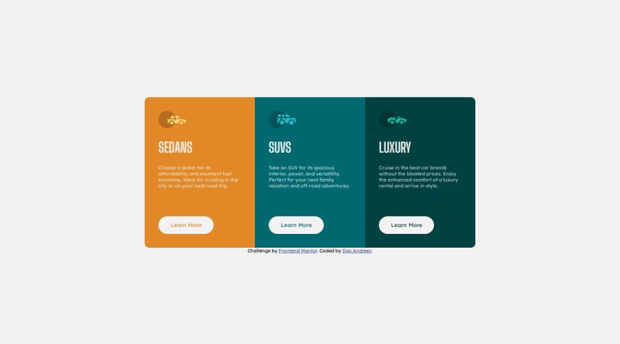
Responsive design of a 3 card component using flexbox
@NeoScripter
Design comparison
SolutionDesign
Solution retrospective
I tried to use the grid layout first to gradually move the cards down one by one as the screen width descreases. The problem with it was that the card was stuck at the beginning of the new row, making it look ugly. Eventually, I ended up using flexbox by setting a fixed flex-basis for every card and aligning the elements to the center.
Community feedback
Please log in to post a comment
Log in with GitHubJoin our Discord community
Join thousands of Frontend Mentor community members taking the challenges, sharing resources, helping each other, and chatting about all things front-end!
Join our Discord
