responsive design, mucho js, template strings, css grid responsivo
Design comparison
Solution retrospective
please feedback
Community feedback
- @palgrammingPosted over 3 years ago
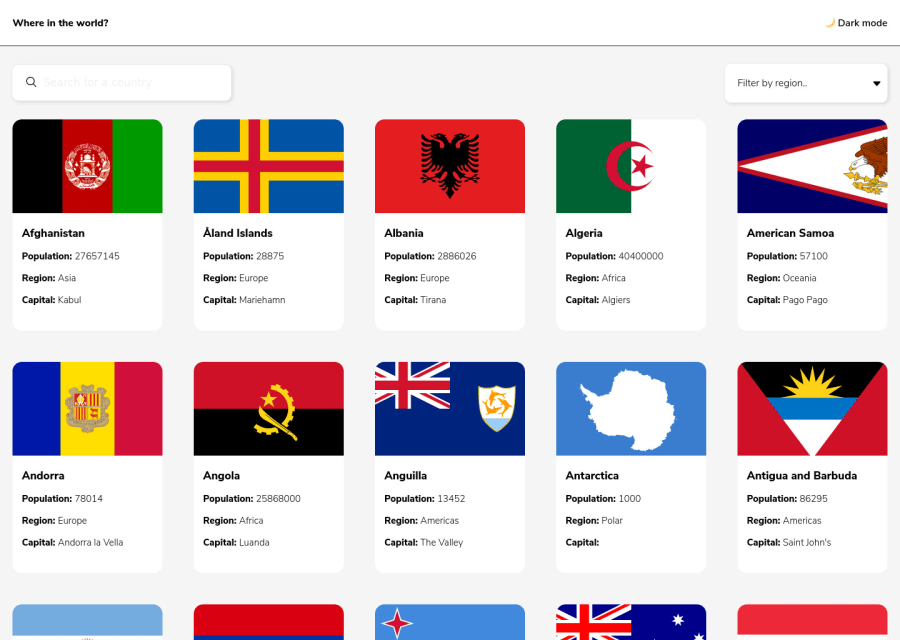
When the user selects a region from the drop-down the list does not show an option has been selected. The countries seem to update but there is no conformation that the user selected the correct region
Marked as helpful0@mmc1999Posted over 3 years ago@palgramming thanks patrick! I'm tried fix it but I havent can.
0 - @pikapikamartPosted over 3 years ago
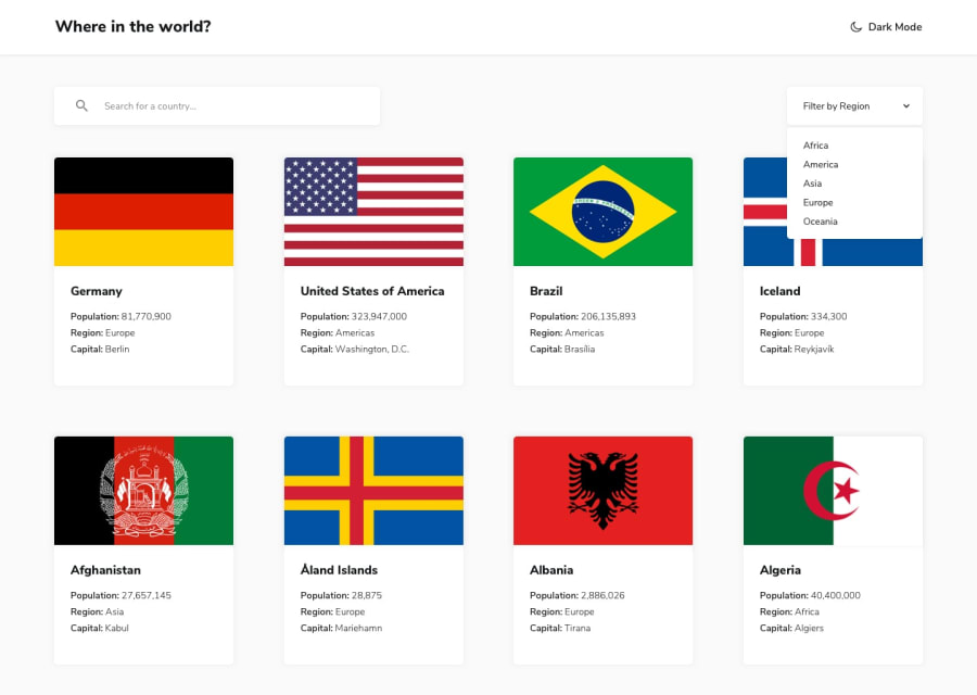
Hey, great work on this one. The layout is different, it contains more country cards, but hey, it is still fine. The mobile layout seems fine as well.
Some suggestions would be:
- The colormode toggler in the
headercould have used ainput type="radio"since that toggler is a selection of color, and radio buttons are great for those. Usingptag is not really accessible. You can look at my solution on how I structured my colormode toggler. It is wrapped in afieldsetalong with thelegend. This creates accessible feature, since if a user navigated through it using screen reader, it will announce what are those radio buttons are for. - Your
mainshould have ah1element, this could be a screen reader only text. - The
inputfor the screen reader could have used a visual indicator like an outline in theirfocus-visiblestate. It is always advisable to add visual indicators in an interactive element. - The search bar as well is not functioning properly. I tried searching
phbut other countries appeared even though they don't have those letters. - It would be good as well to make the
xbutton on the search bar, reset the input overall, so that when I click on it, the countries would go back to the original. - The filter by region could have used a
selectelement, this is much great than usingdivalone without accessibility feature used in the javascript. You can take a look on my solution above, I implemented the filter bar usinglistboxalong with javascript to create more ease navigation. - Just a quick tip, if you are coding a web, try to use the
tabon the keyboard to check if your desired interactive element are being focused, that is really important. - On the
mainpage, the information of each country could have usedulelement, since those are list of information about the country.
Visited country page:
- The
backlink should only usedatag. Do not nestbuttonelement it. Style theaalone with an aria-label likearia-label="back to homepage". - The name of the country could have been the
h1on the visited page. - The information could have used
ulsince those are list of information. - The border countries should have been using
atag rather thanbutton, because those are supposed link to the country name. - The colormode is not working on the visited page, you might want to look at that one out.
Also, a bug of overflow I think. If you click the dropdown, then hover on the country below it, the country overlaps the dropdown.
On the mobile layout, it would be great to only use the
hoverselector, on the desktop layout. Since you don't use mouse in mobile, thehoverwon't fire.Aside from those, you did good in here.
0@mmc1999Posted over 3 years ago@pikamart muchas gracias, si realmente fue muy dificil este ejercicio
0 - The colormode toggler in the
Please log in to post a comment
Log in with GitHubJoin our Discord community
Join thousands of Frontend Mentor community members taking the challenges, sharing resources, helping each other, and chatting about all things front-end!
Join our Discord
