Design comparison
SolutionDesign
Please log in to post a comment
Log in with GitHubCommunity feedback
- @rodolfohgc
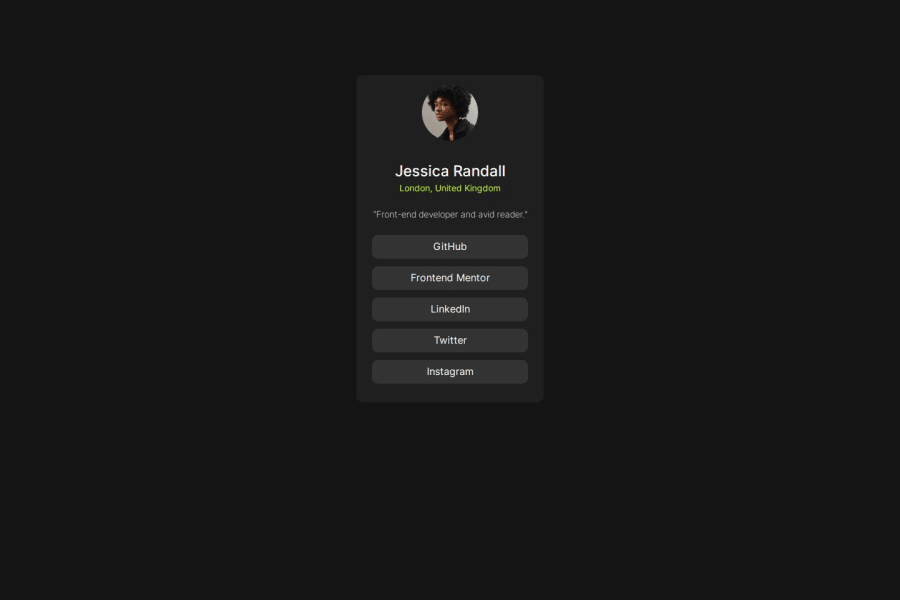
Your design closely resembles the preview; however, I recommend centering the card and slightly expanding the spacing to align with the container's height. Employing font variations could enhance the similarity. Moreover, instead of an <h2> element, consider using an <h1> since it is the primary and sole heading on the page.
Join our Discord community
Join thousands of Frontend Mentor community members taking the challenges, sharing resources, helping each other, and chatting about all things front-end!
Join our Discord
