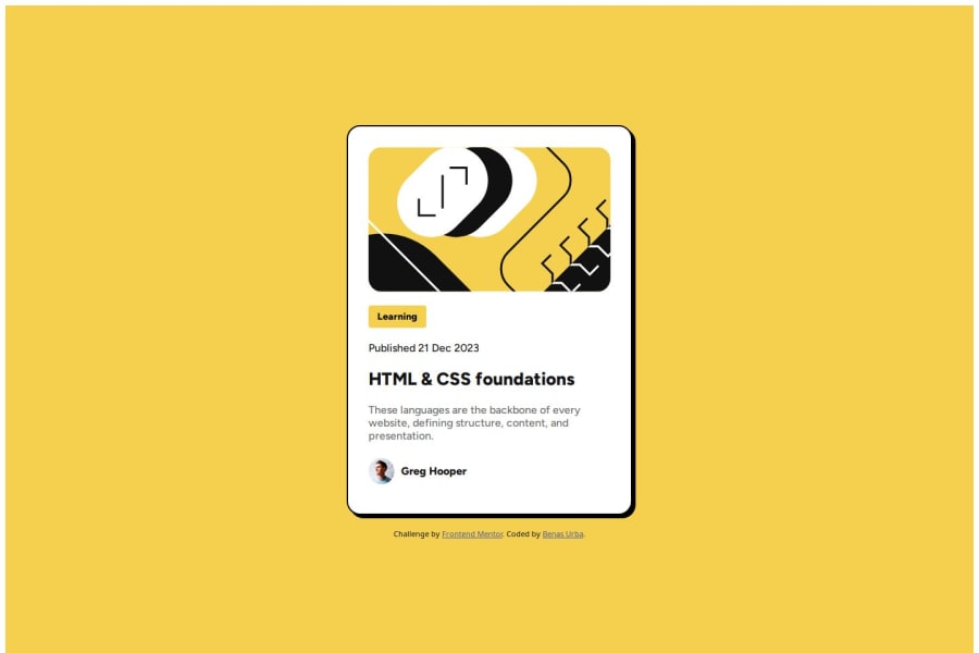
Design comparison
SolutionDesign
Solution retrospective
What are you most proud of, and what would you do differently next time?
I am proud that I managed to create this in a short time span given how new I am to this. Next time I will try to use different values for the widths and heights to try to minimize and avoid using medias.
What challenges did you encounter, and how did you overcome them?Margin challenges occured sometimes, however, through testing I managed to figure out how it works and how to reduce the margins between the components and texts.
What specific areas of your project would you like help with?I would like some help with figuring out what values to use for the dimensions of pages to avoid using medias. Currently I use percentages for my widths.
Community feedback
Please log in to post a comment
Log in with GitHubJoin our Discord community
Join thousands of Frontend Mentor community members taking the challenges, sharing resources, helping each other, and chatting about all things front-end!
Join our Discord
