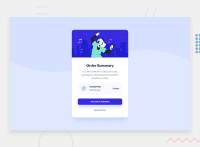
Design comparison
Solution retrospective
How can i improve the code?
Community feedback
- @parthjain0Posted about 3 years ago
It looks very nice. I think the box shadow could be a bit less and the card could be a bit bigger. Also there is a background svg u could add if u want. I am also doing this one right now and facing some issues with the pricing line. Still your looks almost perfect.
1@khalid-sadigPosted about 3 years ago@parthjain98 Thanks alot man for the feedback it helps alot! :)
0@parthjain0Posted about 3 years ago@khalid-sadig i have also managed to complete mine thanks to you...if u are free could u take a look and tell if everythings correct or not https://www.frontendmentor.io/solutions/card-component-with-html-and-css-Sqf0DjrbD
0 - @SlimBloodworthPosted about 3 years ago
It looks great and your code is very easy to read! I'm close, but I'm having trouble getting the pricing items to space themselves properly.
0@parthjain0Posted about 3 years ago@SlimBloodworth same buddy...u found any solution for that? i tried using flex but then all of them are evenly spaced rather than the price being closer to the music icon
0@khalid-sadigPosted about 3 years ago@SlimBloodworth Thanks alot for taking the time to look at my code, try to use flex box it makes things alot easier
1@khalid-sadigPosted about 3 years ago@parthjain98 You can put music item, pricing and cancel link inside a flex container, then you can try wraping the music img and the pricing in one div so you have only two flex items in addition to the cancel link(instead of 3) , then you can use space between on their flex container to separate them. after that you can add margins between the img and the pricing to achive the desired look.
0
Please log in to post a comment
Log in with GitHubJoin our Discord community
Join thousands of Frontend Mentor community members taking the challenges, sharing resources, helping each other, and chatting about all things front-end!
Join our Discord

